
Writing the Street: Building a Photograph with Light and Shadow
Over the summer, I have found myself doing rather more street photography than usual, mainly while travelling through Germany and France and then wandering around London on my return. I just love a bit of London street photography to get the creative juices flowing again.
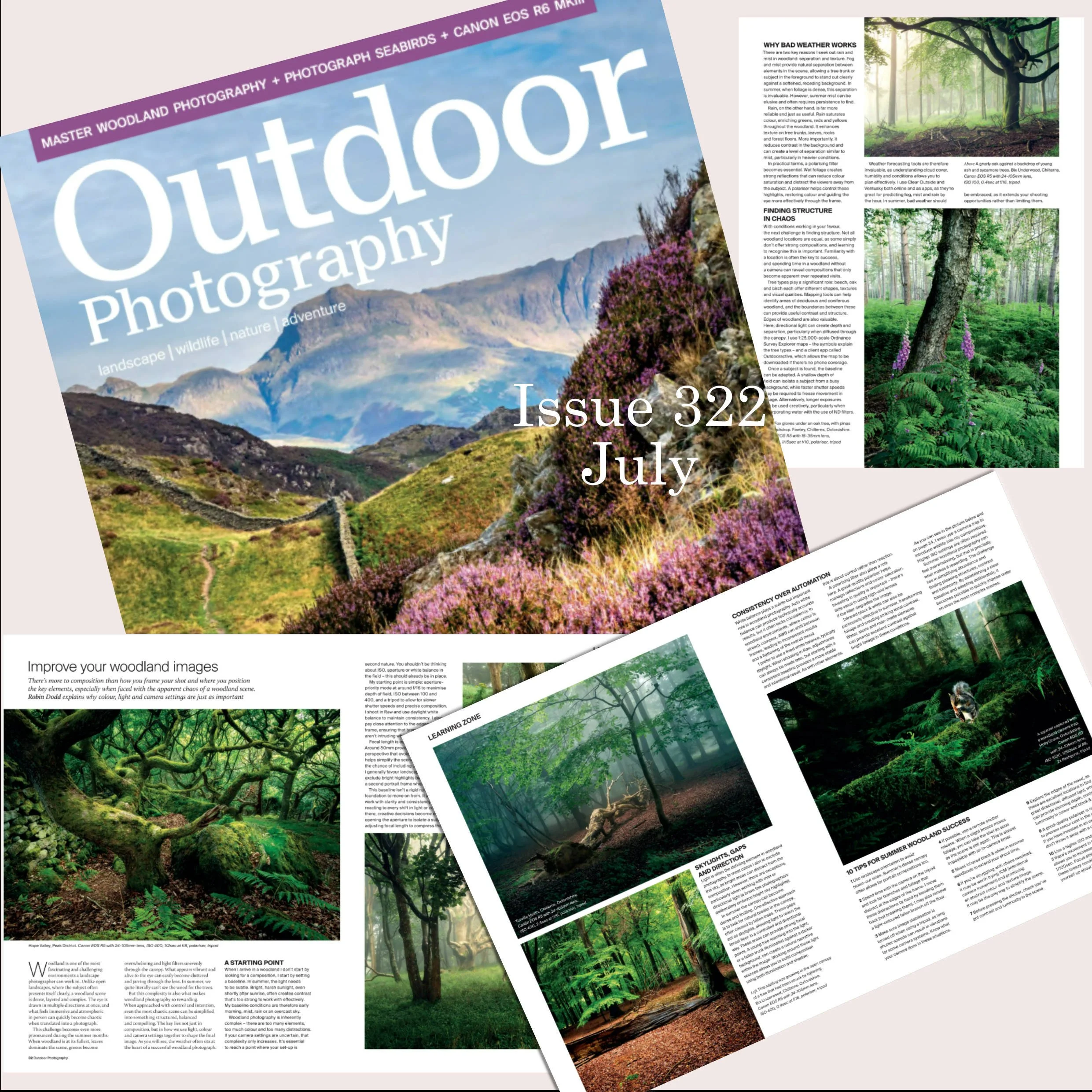
My recent article in July’s Outdoor Photography Magazine
Before I left the UK, Outdoor Photography published my most recent commissioned article on woodland photography techniques. It looks great in print and could be quite useful to other photographers.
These recent trips were really family and holiday trips rather than opportunities for me to gallivant off into the wilderness to photograph landscapes, so I tend to strip my camera kit right back compared to what I carry for a full-on landscape excursion.
Usually that means the Canon R5 with a 35mm and 16mm prime lens. I also sometimes carry my Canon EOS R, which has been converted to 720nm infrared and which I use purely for black-and-white photography. Everything fits into a small daypack and comes out when I see something compelling. This compromise works for Landscapes and Street Photography.
Most of the time there is very little prior planning involved.
The locations I visited on these trips were very different, but looking back through the photographs I realised that I had been approaching them in much the same way.
I wasn't really looking for a particular type of person, building or moment. What I was looking for was clarity: a recognisable subject, supported by composition, light and, ideally, a little emotion.
Street photography can be a visually untidy business. Unlike landscape photography, there is often very little opportunity to simplify what is in front of you. People move, backgrounds change, cars appear and disappear, and things have an unfortunate habit of entering the frame just when you don't want them.
In many ways, though, my technique is surprisingly similar to my landscape photography, which is:
Find the subject and then wait for the right conditions.
I don't tend to shoot from the hip or push the camera into people's faces. I am much more interested in finding the setting, understanding what is happening within it, and then waiting to see whether the elements come together.
That doesn't mean there can only be one element in the frame. Quite the opposite. Some of the photographs I enjoy most contain a great deal of information.
But I do want the viewer to know where to look first. That, for me, is where we begin to get the viewer to read a photograph.
And, as photographers, we can influence that reading. We can effectively write the photograph using light, shadow, colour - or the absence of colour - composition and a little thought.
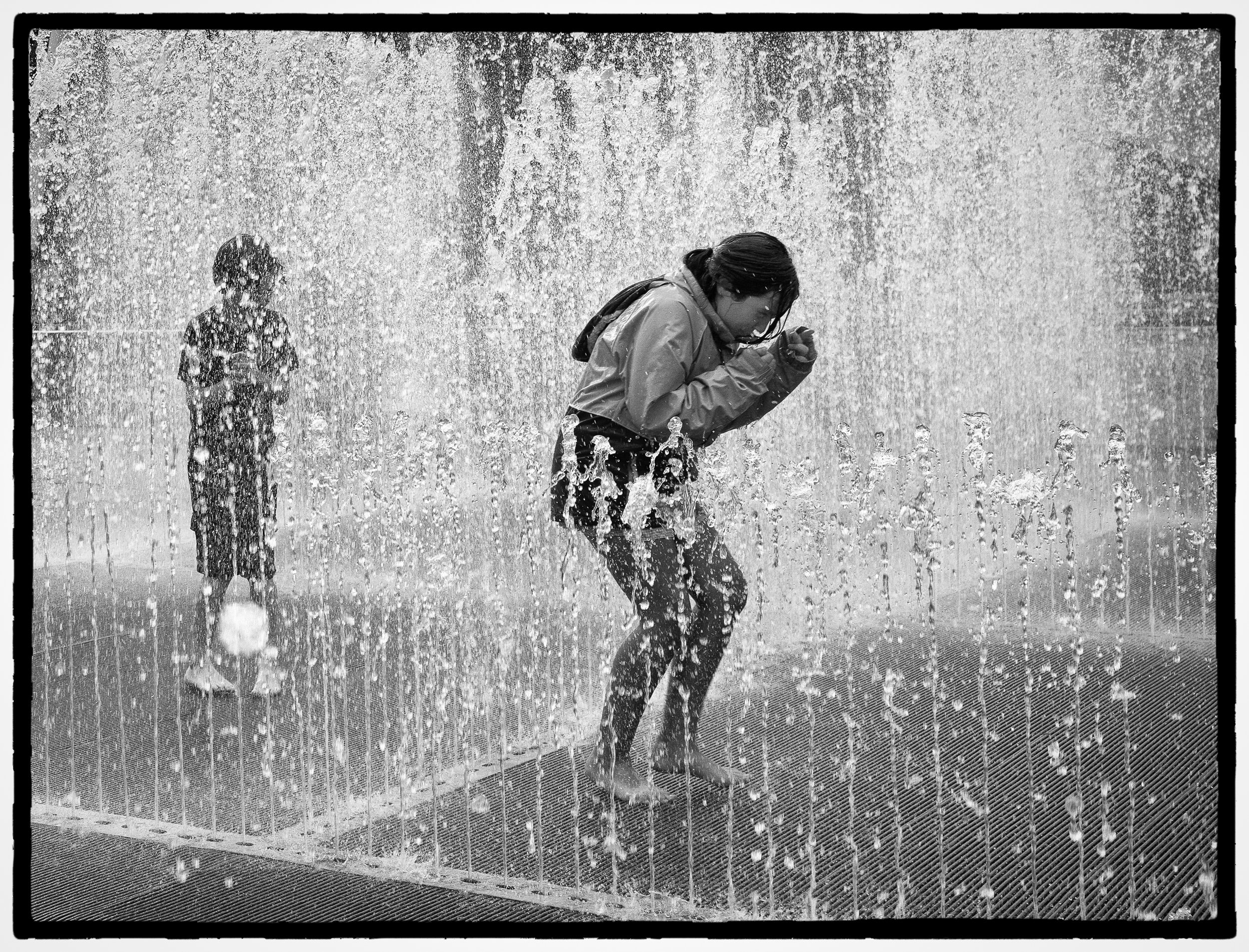
Southbank. A moment frozen in time
This photograph is a good example.
There is an enormous amount happening within the frame. Water is falling and rising in several directions; there are two figures, reflections, movement and a mass of texture.
Yet I think we still know where to look.
The figure bending forward is the main subject. The second figure is important, but secondary. The water isn't simply something happening around them; it separates the figures and helps create the structure of the photograph.
I chose to treat the image in monochrome because I felt colour distracted from the three things that interested me most.
The first is emotion: The reaction of the main figure as they duck into the water gives the photograph its sense of fun and spontaneity.
The second is depth: The layers of water allow us to understand the extent of the fountain, while the second figure in the background adds another human reaction and gives the scene depth.
And the third is time: This is a fraction of a second that has been frozen. A moment earlier or later and the gesture, water and expression would all have been different.
The main story is carried by the reaction and movement of the central figure. For me, removing colour helps concentrate attention on those elements rather than introducing another set of competing visual information.
This is one of the reasons street photography in black and white works so well for me.
A photograph can contain a lot of things without being about all of them.
Sometimes we need to strip out competing distractions. That might be done through composition or cropping, through shadow, or occasionally simply by removing colour.
Architecture as a stage
I have always enjoyed architecture photography when walking around cities — perhaps unsurprisingly, as my wife is a chartered surveyor!
But that doesn't necessarily mean the architecture is always the main subject.
Quite often I use architecture as a stage for a chosen subject.
Buildings provide lines, shapes, repetition and, perhaps most importantly for me, areas of light and shadow. Once I find an arrangement that interests me, I can wait to see whether somebody enters the right part of it.
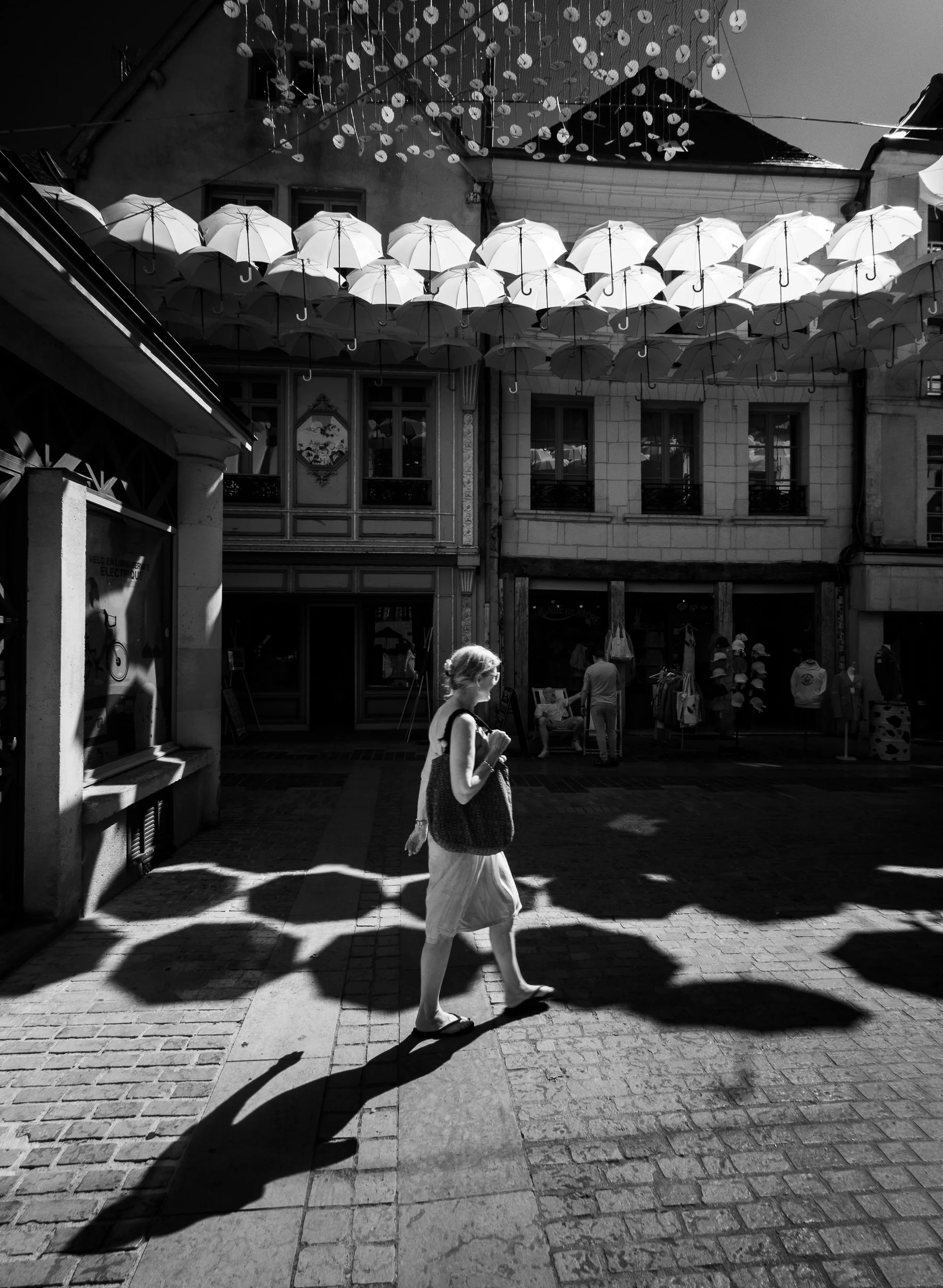
Street Photography: Black and White or Colour?
Lying in wait
This image is a street in France that was lined with umbrellas as a form of sunscreen and artwork. Here the umbrellas immediately give the photograph its structure. There is repetition overhead and a second pattern created by the shadows beneath them.
But the woman walking through the patch of light becomes the subject.
Without her, I would still have a photograph of an interesting place. With her, the picture becomes about something else. It gives rise to more questions. The ladies shadow leads the eye into the scene. Then the eye passes the lady and moves to the questions about why there are so many umbrellas in the sky.
The architecture has a job to do, but it is supporting the subject rather than competing with it.
Colour contrast can be as essential as monochrome contrast
For the next example, I did exactly that: found the location, recognised what the light was doing and waited for the right subject to pass through my composition.
The same principle becomes even more obvious in this London photograph.
The architecture occupies almost the entire frame. The figure is small by comparison, yet I don't think there is much doubt about where the eye goes first.
The red skirt helps enormously, of course, but so does the light contrast. She has walked into a small illuminated area surrounded by very deep shadow.
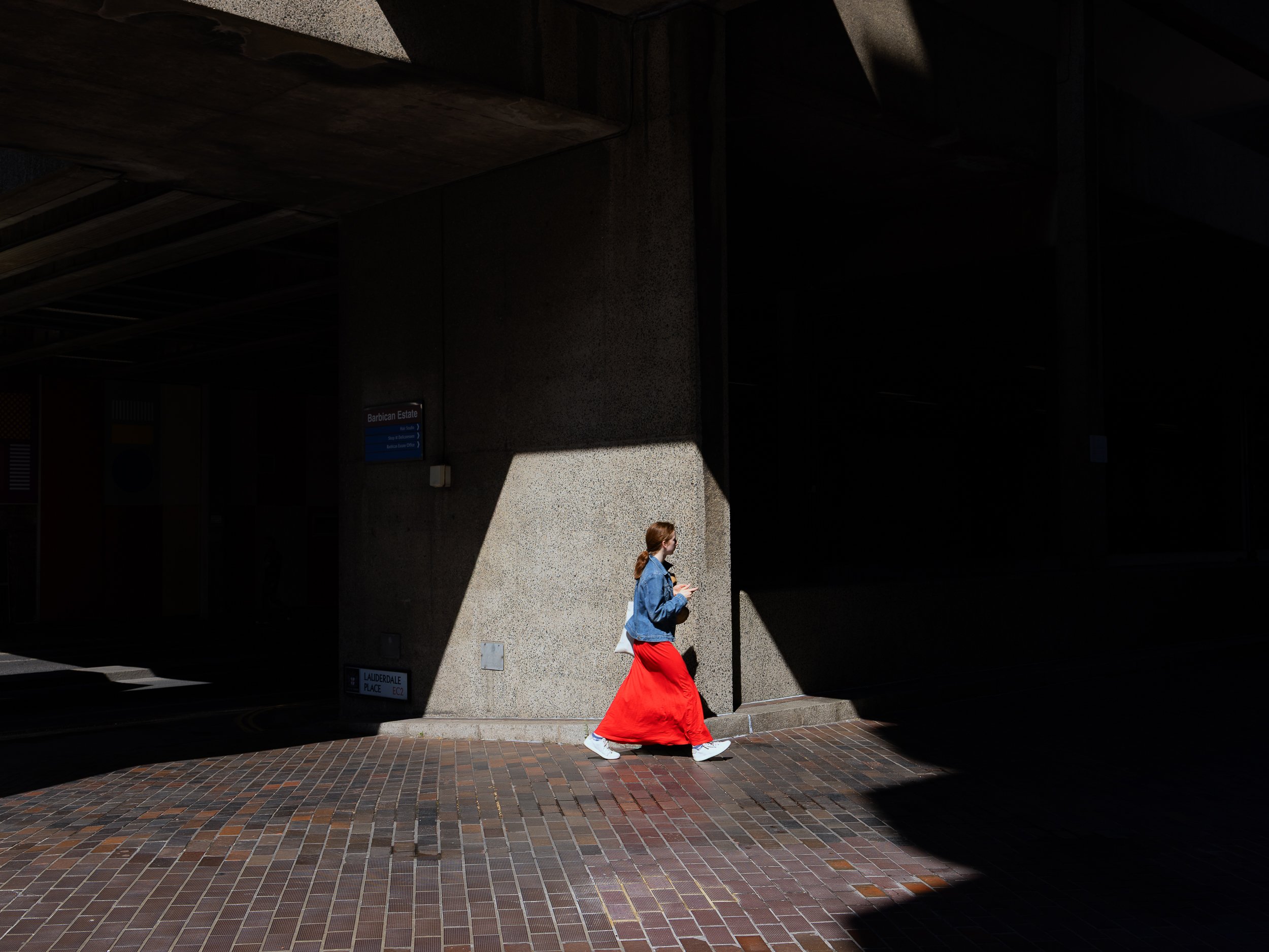
Architecture and street photography meet at the Barbican, London
For me, this photograph is considerably weaker in black and white. The red skirt is doing much of the important work. It is the colour contrast that immediately takes us to the subject.
I had already composed the architecture. What I needed was somebody in the right place. So it was just a question of waiting for the right subject to walk past.
That is one of the things I enjoy about this kind of street photography. It isn't necessarily about chasing people.
Sometimes you find the photograph first and wait for the subject to arrive and complete it.
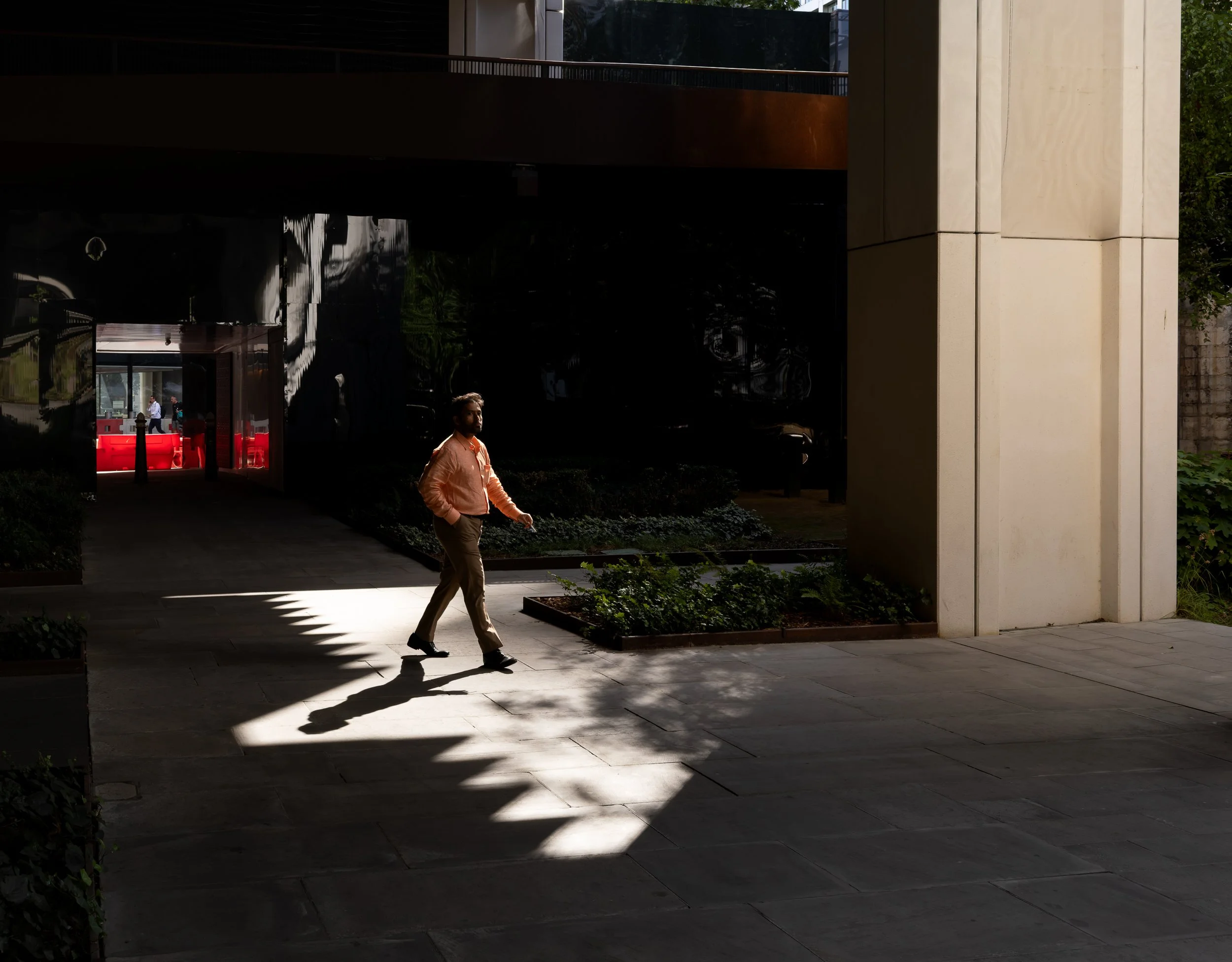
Waiting for the subject to enter the scene and become the star of the show. Identify the light, location and wait.
This second London photograph works in a quieter way.
There is less colour to attract the eye, but the principle is much the same. A relatively small figure is picked out by a patch of light within a much larger dark structure.
The surrounding architecture is still very important, but it gives the man somewhere to exist within the photograph. In my view, it was essential to get the full shadow of the subject framed within the pavement to make this work.
Using shadow to remove things
I have always liked using strong shadow in street photography. Partly this is simply because I like the visual effect, but there is another reason:
Shadow removes things.
Cities are full of competing information. Signs, windows, people, paving, doors, furniture and dozens of other details can all demand attention.
Allow large parts of the scene to fall into darkness and much of that information disappears.
What then remains becomes more important.
One photographer whose work has strongly influenced the way I think about this is Alan Schaller. His use of deep blacks, strong light and isolated figures is extraordinary, and I will put a link to his work at the end of the article.
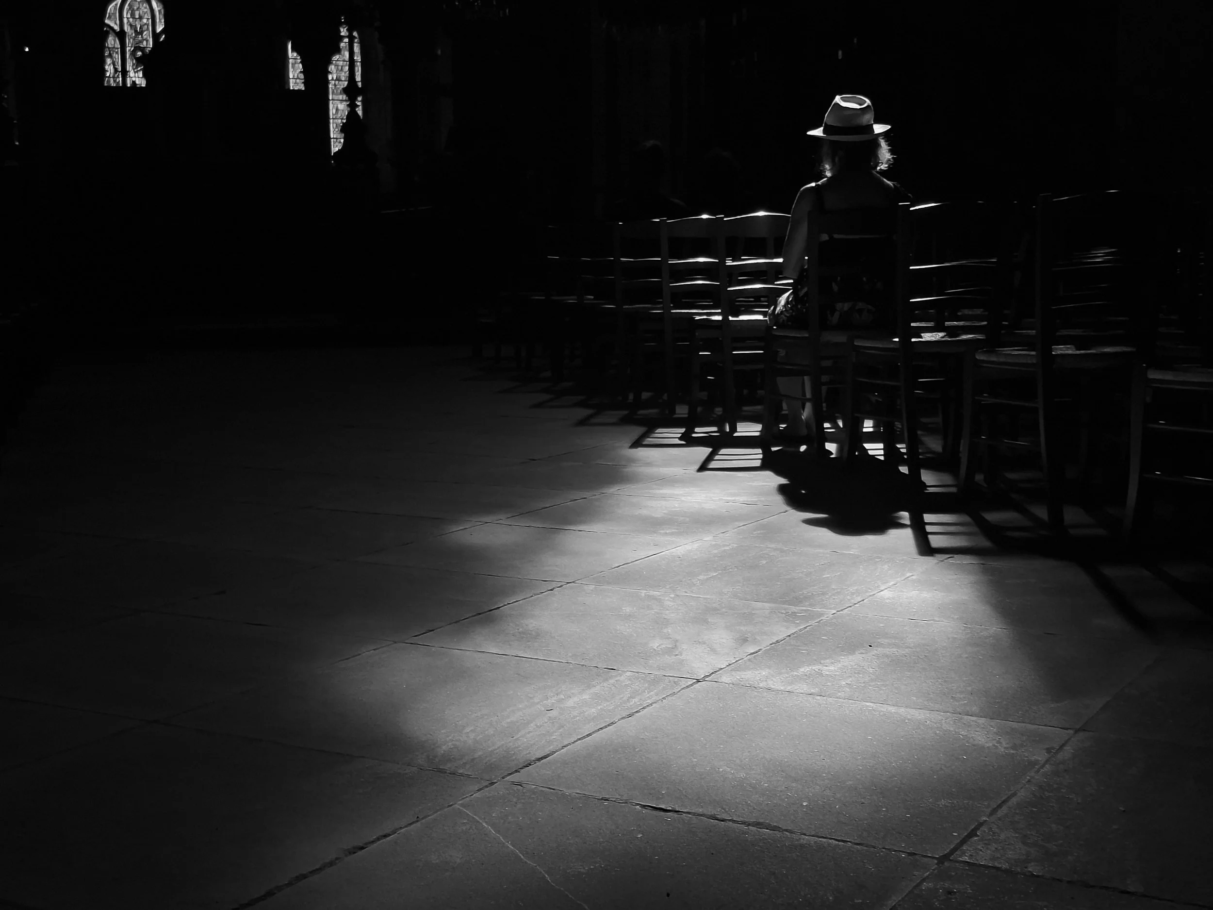
Shadows exclude and hence simplify
Spotlighting the subject using existing contrast
This is probably one of the clearest examples in the image of the woman sitting on a chair.
There is a large amount of architecture here, but most of it has almost disappeared.
What remains is the light on the floor, the edges of the chairs and, most importantly, the illuminated figure.
Even the small highlight around the hat becomes significant because everything surrounding it is so dark.
There is a slightly amusing technical footnote to this photograph. My camera battery had gone completely flat, so it was taken with a fairly inexpensive Android phone.
It is a useful reminder that recognising the photograph is generally rather more important than the equipment used to take it.
For me, this is also one of the great strengths of black and white.
Colour can be very useful for separating a subject, as in the red-skirt photograph, but colour can also become another piece of information that has to be organised.
Black and white can strip some of that distracting information away.
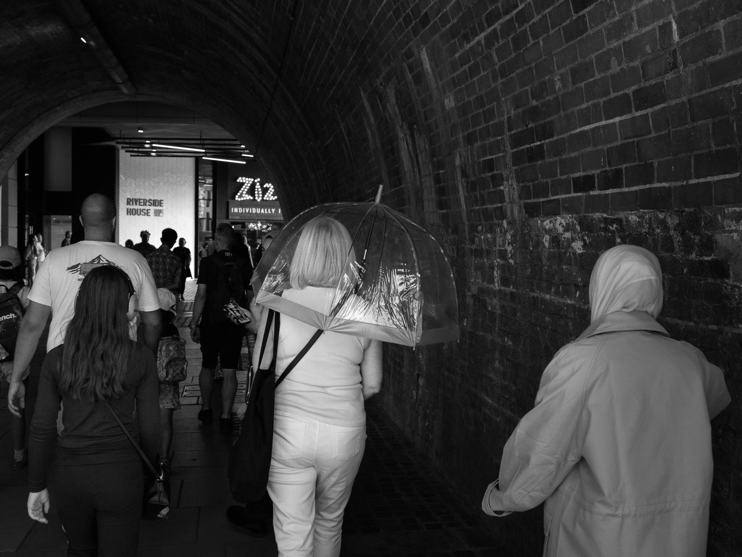
Street photography black and white. Isolating the subject from the crowd
That doesn't necessarily make a photograph simpler in terms of its content, but it can make it simpler in terms of how we read it.
Here, there are several people and no single dramatic shaft of sunlight. Instead, the large brick wall, tunnel and different tones of clothing create the structure.
There are two ways I commonly work in situations like this.
I may find a location and wait for somebody to pass through it, or I may spot an interesting subject and follow their progress for a while until they move into a better environment.
In this case I noticed the transparent umbrella. I didn't immediately make the photograph because the woman was initially lost amongst the other people. I waited until she became more isolated within the frame.
The umbrella then becomes an important shape almost in its own right.
Again, I am interested in the order in which the viewer discovers the different elements.
Leading the eye
Sometimes the subject is established less by isolation and more by direction.
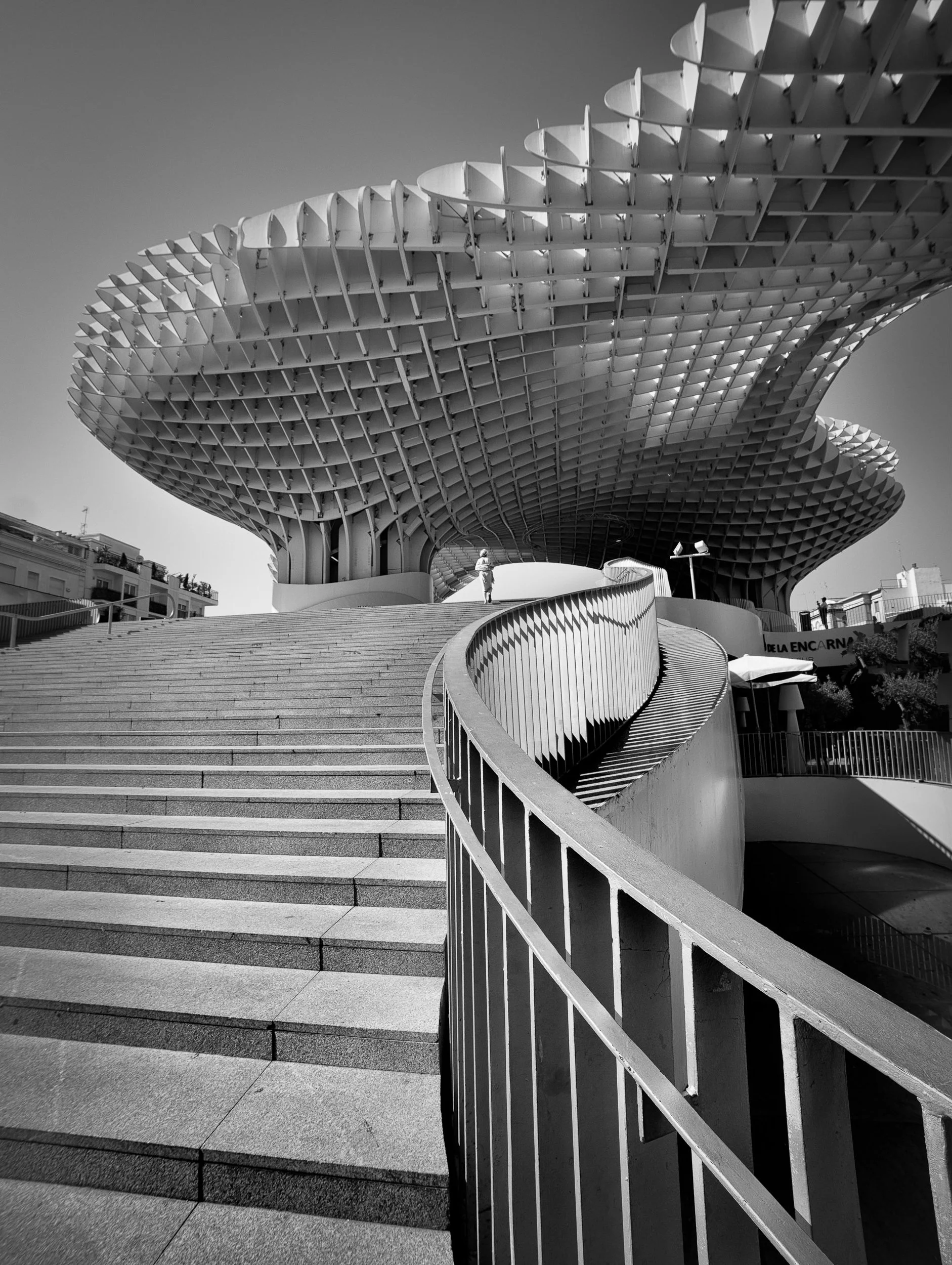
Metropol Parasol, The World’s Largest Wooden Structure.
In this photograph, the railings and overhead structure lead towards the distant figure.
The person is extremely small within the frame, but the whole photograph seems to point towards them.
The architecture and light are doing the compositional work.
The huge overhead structure, the steps and the sweeping curve of the railing dominate the frame. The small figure near the top is important, but for a different reason.
The person provides scale, life and a point of human reference.
When the architecture really is the subject
Of course, sometimes the balance shifts completely.
Sometimes the building genuinely is the subject.
The important thing, I think, is recognising the difference.
I made this photograph several years ago, but it fits naturally into what I have been thinking about this summer.
Here, the architecture is unquestionably the main subject.
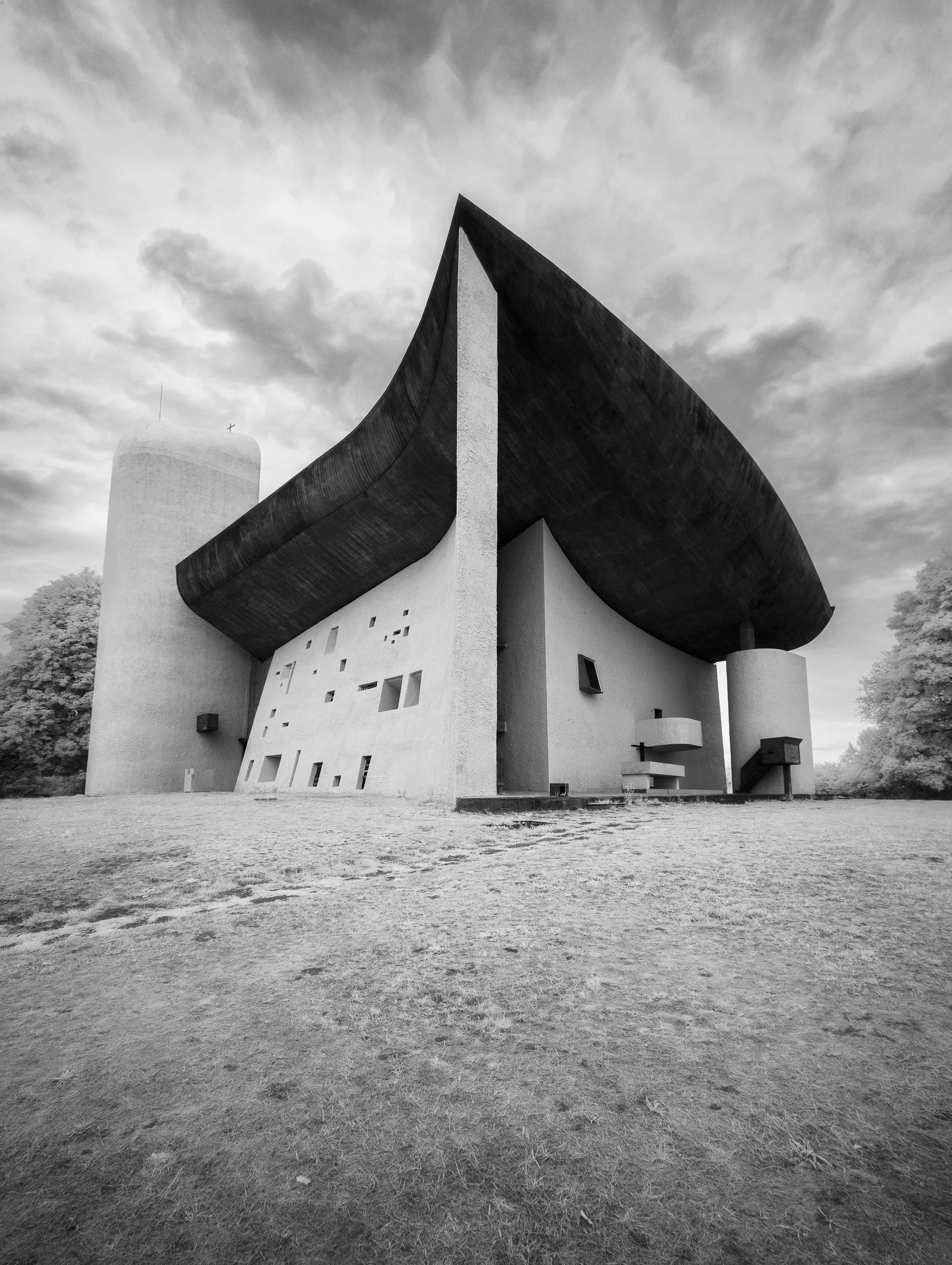
Infrared version of Notre-Dame du Haut, Ronchamp, France
Without that figure, the photograph would still be about the architecture. The person simply helps us understand it.
That is almost the reverse of the London photographs, where the architecture is generally supporting the person.
It is a small distinction, but an important one:
Am I photographing a person within architecture, or am I photographing architecture with a person in it?
In this next image of a French Chapel, there is no person at all.
The building is quite capable of carrying the photograph by itself.
Its shape, the enormous dark roof, the curves and the relationship between the building and the sky are the subject.
For me, adding a person might actually weaken the image by giving the viewer somewhere else to look.
Knowing the subject also means knowing when not to include something.
We are not the creators of these buildings. There was art and creativity from the original architect. The photographer cannot take credit for that, unless they are adding something extra- an element and emotion to the image. An average shot is just a recording of what we have seen. There is no credit really to be attributed to the photographer for documenting what anyone else could have done.
However, here I hope that I have shown a creative vision that is outside that documentary box. I say this, as the image is made using an infrared camera and there is an element of skill in timing and use of monochrome tonality when producing such images.
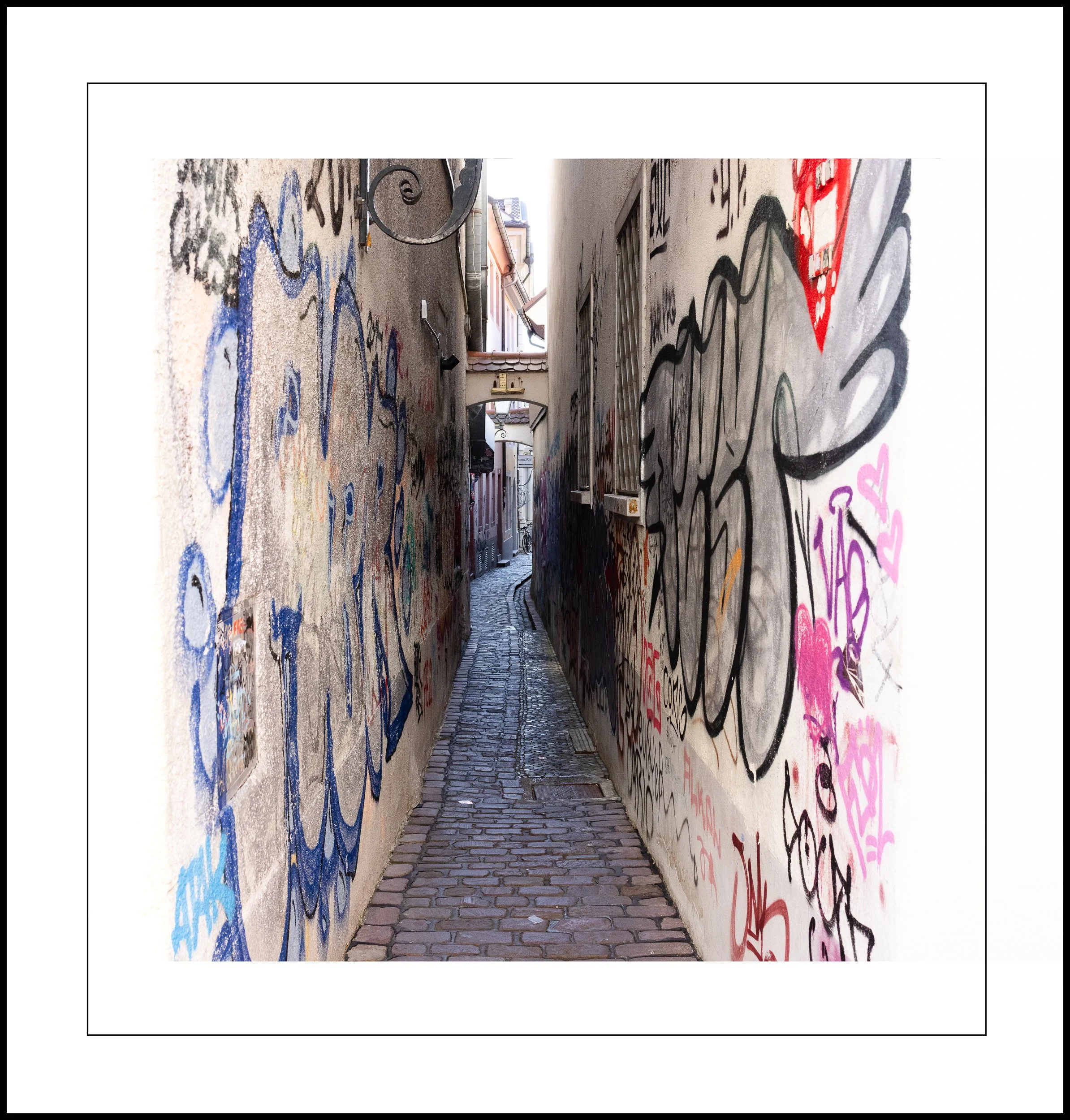
Street graffiti, Germany.
Street Graffiti
The same applies to this narrow passage.
It isn't really a photograph about an individual piece of graffiti. This alleyway is in Germany and having lived in Berlin for many years, I know the Germans excel at graffiti because they spent so much time practising on the Berlin Wall…which is now sought-after art if you can get your hands on it.
What interested me here was the passage itself - the way the two walls pull the eye through towards the tiny opening at the far end.
The graffiti provides colour and texture, but the subject is really the space.
But don't become too wrapped up in this as some sort of rule.
Put the right person in exactly the right place in this alley, and I might make a completely different but compelling photograph.
There is no absolute right or wrong here.
A very small person can still matter
This is not just what Winnie the Pooh said to Piglet one day as they threw sticks into the river to make him feel better. There is, in fact, some truth in the idea.
This photograph sits somewhere between two approaches.
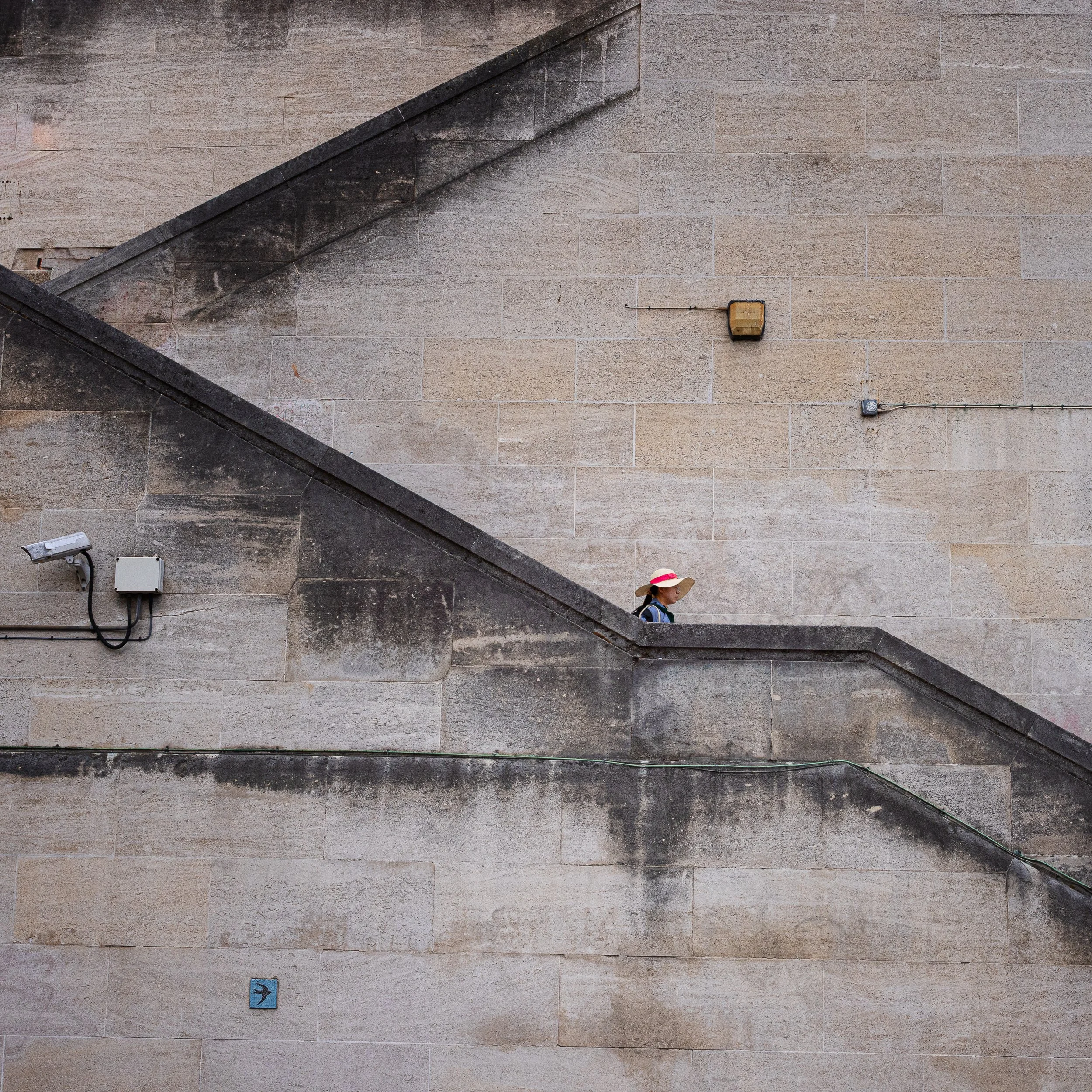
London street scene made big by the small
The architecture dominates, and most of the frame is simply stone.
Yet the small figure appearing between the two diagonals completely changes the photograph.
She occupies only a tiny part of the frame, but the coloured band on her hat provides just enough separation to make us notice her immediately.
That is something I find increasingly interesting in street photography.
The importance of a subject has very little to do with how much of the frame it occupies.
There were about a 100 people passing these steps as I patiently waited. Only this lady worked for me to draw the viewer’s eye and help write the image the way I wanted it.
Sometimes making a person smaller actually gives the surrounding architecture more power - and, paradoxically, makes us more conscious of the person within it.
For me, the monochrome version was much too weak. Once that small accent of colour disappears, the figure becomes far less significant and the photograph begins to be read primarily as a study of stone and geometry.
That colour is therefore part of how I have written the photograph and how I hope the viewer initially reads it.
Colour (or no colour) can change the story
The final example is perhaps the most useful because it shows how exactly the same photograph can be read in two different ways.
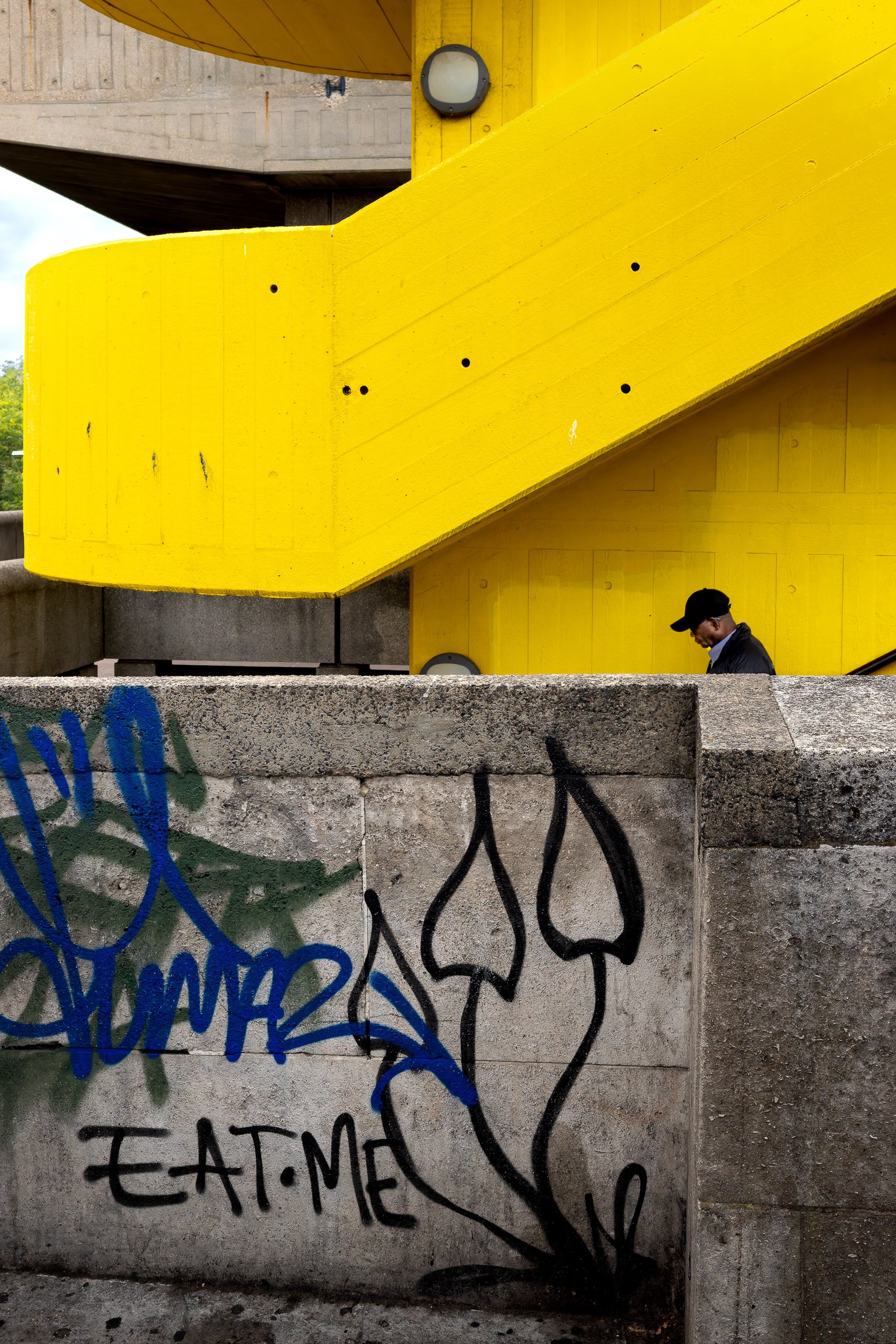
Street Photography: Black and White or Colour?
I had noticed this location previously and deliberately returned to it.
The bright yellow architecture was obviously striking, but that wasn't enough on its own.
What really interested me was the graffiti on the foreground wall.
Among it are the words EAT ME, together with marks that seem to point towards the steps.
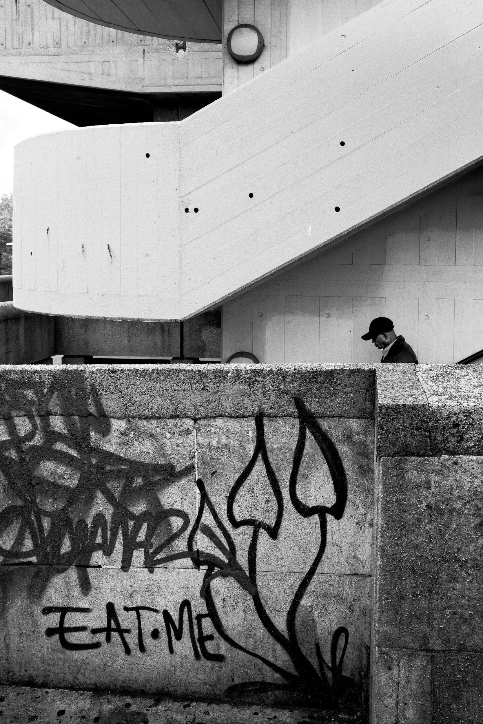
For me this version works better, as the viewer sees the “Eat Me” first, which was the intention.
I realised that if I could get somebody into the right position there was potentially another layer to the photograph.
Eventually this man began descending the steps.
Suddenly the different elements connected.
This is also a useful reminder that street photography isn't always about reacting in a fraction of a second.
Sometimes most of the photograph is already there.
You recognise the stage, work out what is missing and wait.
Or occasionally, as I did here, you come back.
In the colour photograph, however, something interesting happens.
The yellow is so powerful that the architecture initially dominates. We see the huge graphic shape first and only afterwards begin to discover the man, the graffiti and the EAT ME relationship.
When I convert exactly the same frame to black and white, the story changes.
The yellow loses its visual advantage.
Suddenly the man, graffiti, concrete and diagonal architecture begin to compete on more equal terms.
For me, the small narrative between the graffiti and the descending figure becomes considerably more apparent.
Neither version is necessarily right or wrong.
They simply encourage us to read the photograph differently.
And that is why I don't regard black and white as simply a stylistic treatment.
Changing a photograph to black and white doesn't just change how it looks. It can change the order in which we read it.
Writing the photograph
Perhaps that is the thing these photographs have in common.
Photography is partly about seeing, but it is also about deciding what you would like somebody else to see.
Light can tell the viewer where to look.
Shadow can hide information that isn't needed.
Colour can make a tiny figure dominate a huge building.
Lines can lead us towards somebody who occupies only a fraction of the frame.
And sometimes architecture is the subject itself, with people merely helping us understand its scale.
I don't think there are rules about which element should dominate.
The important part is knowing what you want the photograph to be about.
Before pressing the shutter, I increasingly try to answer two simple questions:
1) What do I want somebody looking at this photograph to notice first?
2) What emotion do I want the image to convey to the viewer?
I can't dictate exactly how another person will interpret an image - and nor would I want to.
But I can guide them.
Once I know what my subject is, everything else in the frame has a job to do in helping the viewer find it.
Here is the link to Alan Schaller:
I was brought up on film photography, shooting and developing my own images with chemicals and papers. As a result, I appreciate how modern digital technology has allowed us to manipulate the tonality of our images. This analogue experience allows me to appreciate how this new digital era can be embraced and used to get the best out of our images. Now I often use DxO Silver EFX or the DxO Film Pack software to emulate the tones of different types of film that I still sometimes use. This helps me provide the emotional impact an image deserves. For street photography, I would urge you to try out the black and white films emulators such as Ilford Delta 400, and Kodak Tri X 400 and play a bit with the tonality/contast within these film types. When using film, I often extend the processing of the negatives in the darkroom to get the right contrast look on the negative….DxO is giving you a second chance to get this right and that is really cool.
DxO Software: Readers can get 15% off DxO software using my affiliate link and the code FastFox
The link to the software is here: https://tidd.ly/42bLV8M
Please feel free to comment below and I will answer any questions.