
The Colours of the Pacific Northwest: Camera Settings and Colour Grading
What I discovered is the key ingredient to any great image
Colour is one of the most powerful tools available to a landscape photographer. Good colour photography is not simply about creating bright or highly saturated images. Colour can describe the conditions, separate elements within a busy composition and, perhaps most importantly, communicate how a place felt. Blues can be cool and moody. Oranges are warm and inviting. Greens and yellows often seem tranquil.
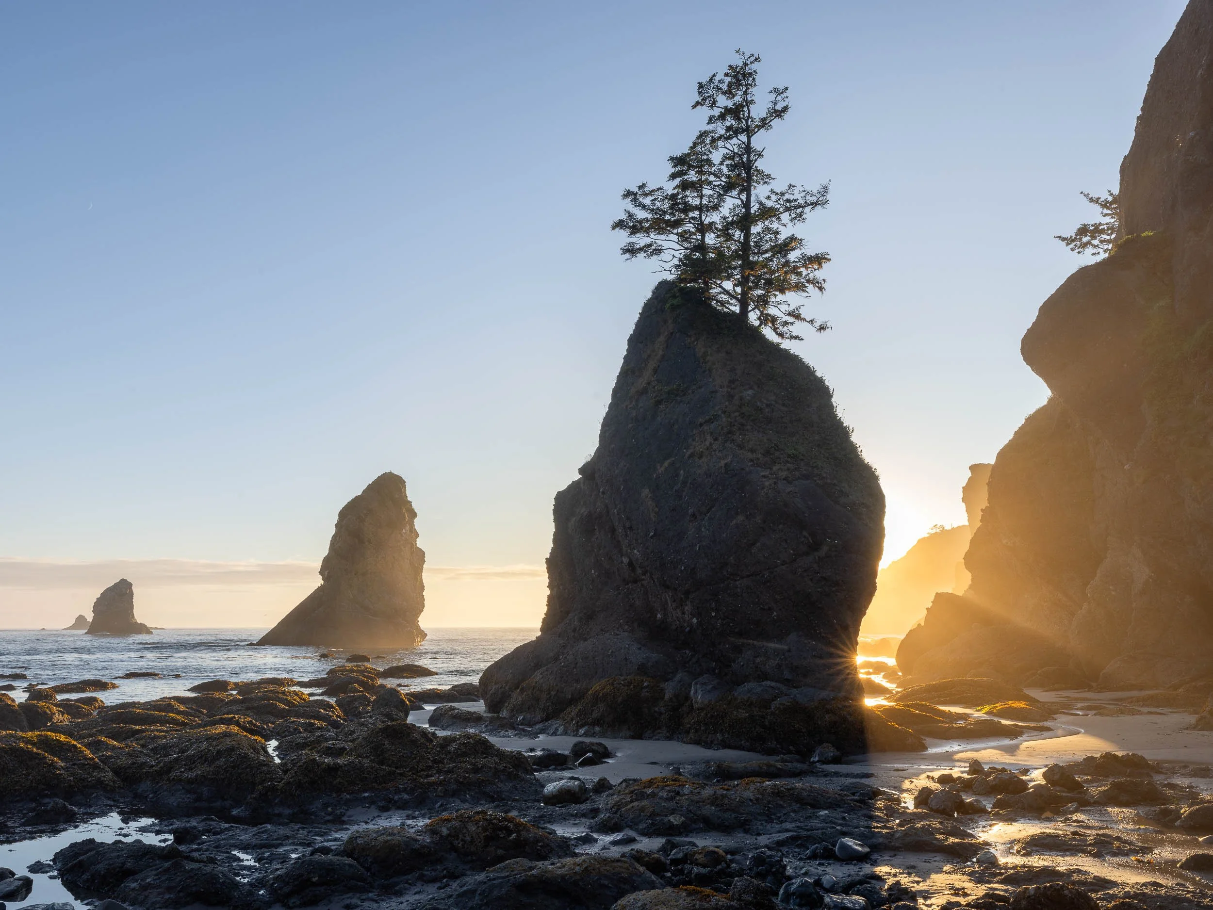
Sunset on Shi Shi beach sea stacks, USA
I had left the UK during one of the most intense heatwaves since my youthful days of the much-lamented “Summer of 1976”. As the plane sped towards the frozen plains of Greenland and then on to Seattle, I looked out of the window at 30,000 feet to see the awesome sight of the Welsh Snowdonia mountain range covered in a cloud of smoke of epic proportions. This smoke was drifting from the raging wildfires to the eastern side of the country and I assume being bravely battled by the fire service and local communities.
During this recent trip to Washington State in the Pacific Northwest, I found myself working with colour in three very different ways. The results depended partly on the light and landscape, but also on my camera settings, particularly the white balance choices I made while photographing each scene.
At Shi Shi Beach, the setting sun produced warm yellows, oranges and pinks, balanced by cooler blues in the sea, rocks and shadows. On another evening further down the coast, an overcast sunset and famous mist rendered the coast in much colder shades of blue. Rather than trying to warm that photograph, I decided to embrace and enhance its coldness. Hopefully I can show how such an approach produces the atmosphere which is the key element of any landscape image. Colour and atmosphere are deeply bound together. If the atmosphere seems wrong, try checking that your colour tones are correct for the image.
In the Hoh Forest within an area called the Hall of Mosses, I was enveloped in green, blue and yellow tones as the sun tried to break through the forest canopy. Beautiful images can only be envisioned and enacted upon if your camera is showing the right array of colours that you have available to make those compositions. The colours captured in your woodland image are often as essential as the various forms and structures that those colours surround in the forest.
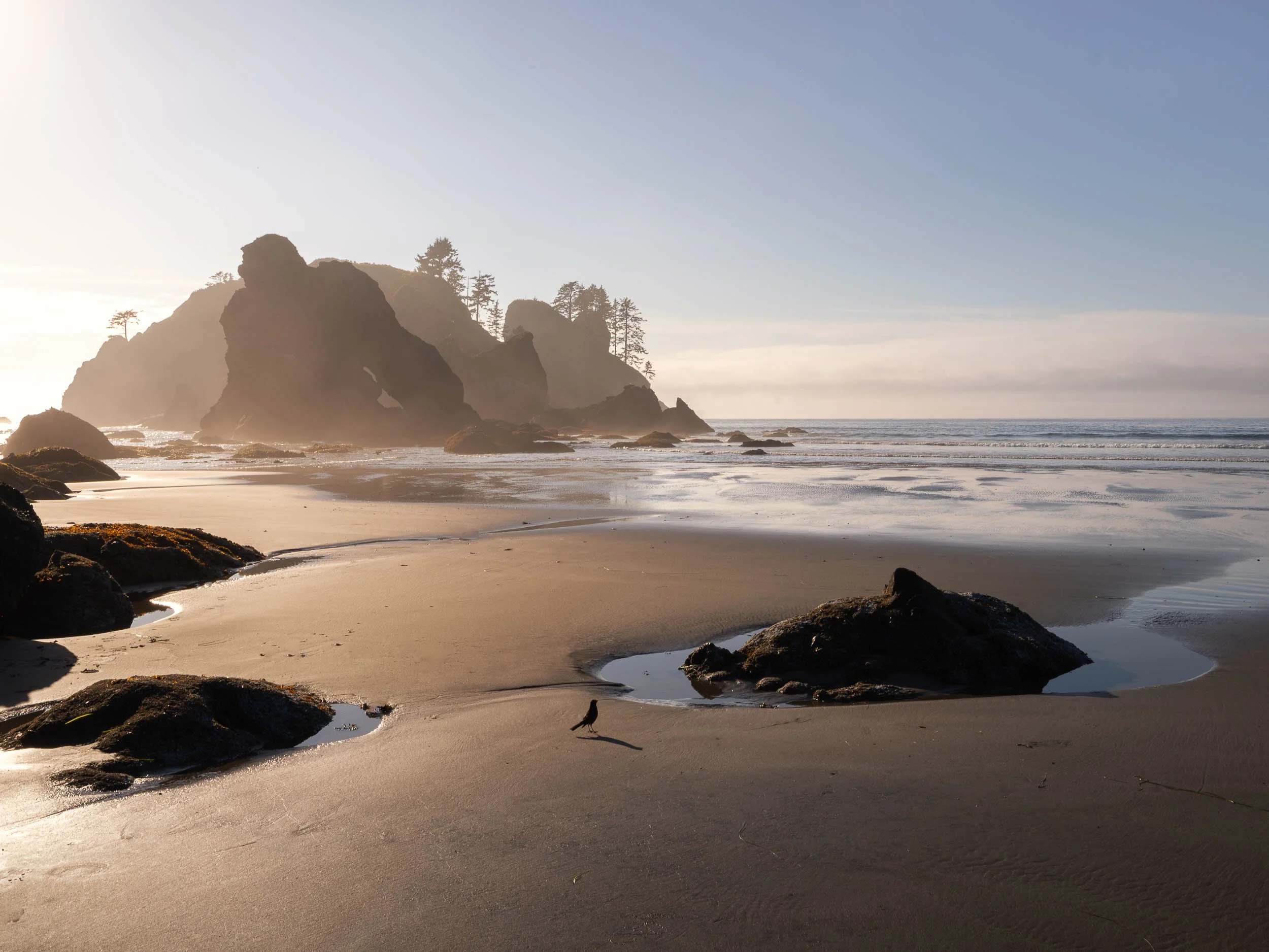
An easy shot before light become too dynamic and tricky. 30 minutes later more sophisticated techniques are needed to capture the scene.
Then there was an area of forest affected by the Olympic National Park 2025 wildfires. Here, much of the colour had effectively disappeared. The burned trees and damaged ground were already close to monochrome, with only occasional patches of pink wildflowers breaking through the subdued landscape. Strangely, working with this type of colour (or lack of) can be even more powerful than the above situations.
These situations required very different editing decisions. Together, they reinforced something I have believed for some time: white balance, camera settings and colour grading are not simply technical considerations. They are creative choices that can change the entire emotional direction of a photograph. I was recently put on the spot when asked what the key element was in an image. I settled on the simple answer: “Emotion.” As I get older, this seems a stronger reason to make the images than ever before. No emotion?…. probably destined for the recycle bin. Alt/Control/Delete!
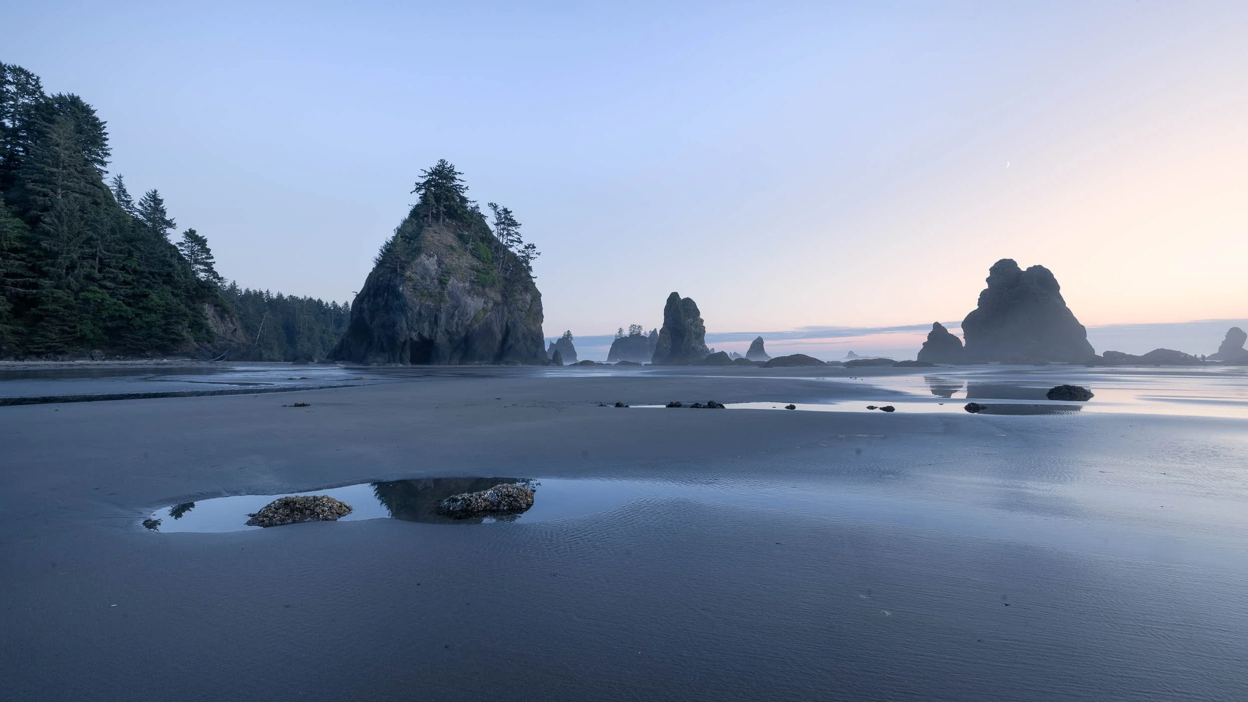
Sea stacks after sunset. Blue cool tones.
A photographic invitation to Washington
The trip came about through my friend, American landscape photographer David Roth, who invited me over and looked after me extremely well.
Dave provided local knowledge, transport and accommodation in his very spacious RV camper. He also put up with several days of me fretting about where the best locations could be found, weather conditions and where the next “keeper” might be waiting around the corner. This was particularly generous considering that I repeatedly attempted to steal his compositions, food and drink throughout the trip.
At Shi Shi Beach, for example, Dave had found a promising position among the tide pools. I helpfully informed him that there were some enormous starfish just around the corner. Once he had moved off to investigate, I borrowed his spot and took my own photograph.
In my defence, there really were some impressive starfish around the corner.
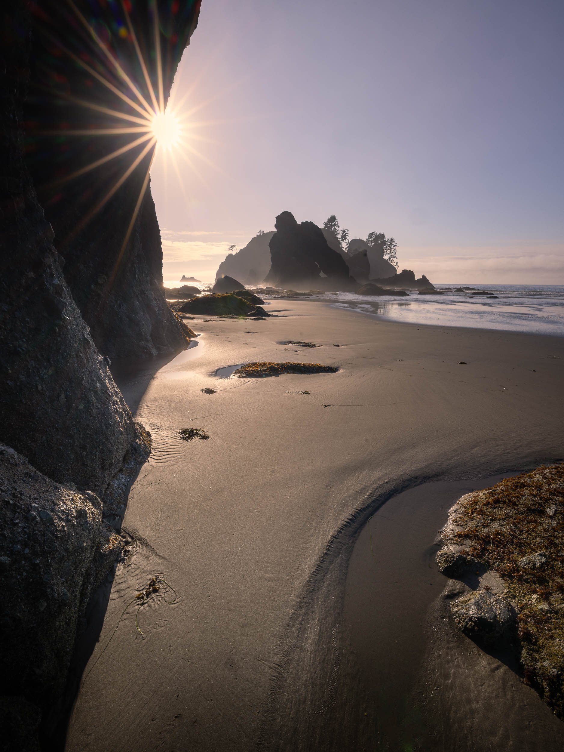
Sun star and sea stacks
Shi Shi Beach involves a fairly substantial walk, particularly when carrying camera equipment. We arrived several hours before sunset and waited for the light to develop (We even fell asleep far an hour on the beach). Once it did, the pace changed very quickly. Reflections appeared in the pools, the sea stacks became silhouettes with sun stars. Colour began to gather close to the horizon and envelop the sea stacks. The walk in had been quite strenuous with all our kit and so I was quite surprised to see how many people had also backpacked in with tents and even surfboards to camp overnight at this spot. That is probably a testament to how awesome the location is.
We then had the pleasure of walking approximately four and a half miles back in the dark, which was actually great fun and entailed a few heated discussions about the standard of my map-reading skills in the pitch-black forest! Then my headlamp died on me. Yep, I carry a spare; that lesson was learnt years ago. (While I am on the subject of navigation, my GPS Suunto running watch has always been a lifesaver with the O/S style colour maps and routes loaded into it.)
Warm light at Shi Shi Beach
The Shi Shi Beach photographs represent the warm end of the colour spectrum from the trip.
The light contained yellows, oranges and pinks, while the rocks, water and darker areas retained cooler blue tones. This natural separation between warm highlights and cool shadows gave the photograph much of its depth and emotional impact. Standing in the cool shadows, looking out to the fading rays of brilliant light.
Capturing the full range of light required several exposures. (This is known as exposure bracketing). One exposure protected the darker blue shadow areas, the second the mid-tones and the third the warmer yellow highlights from the sun.
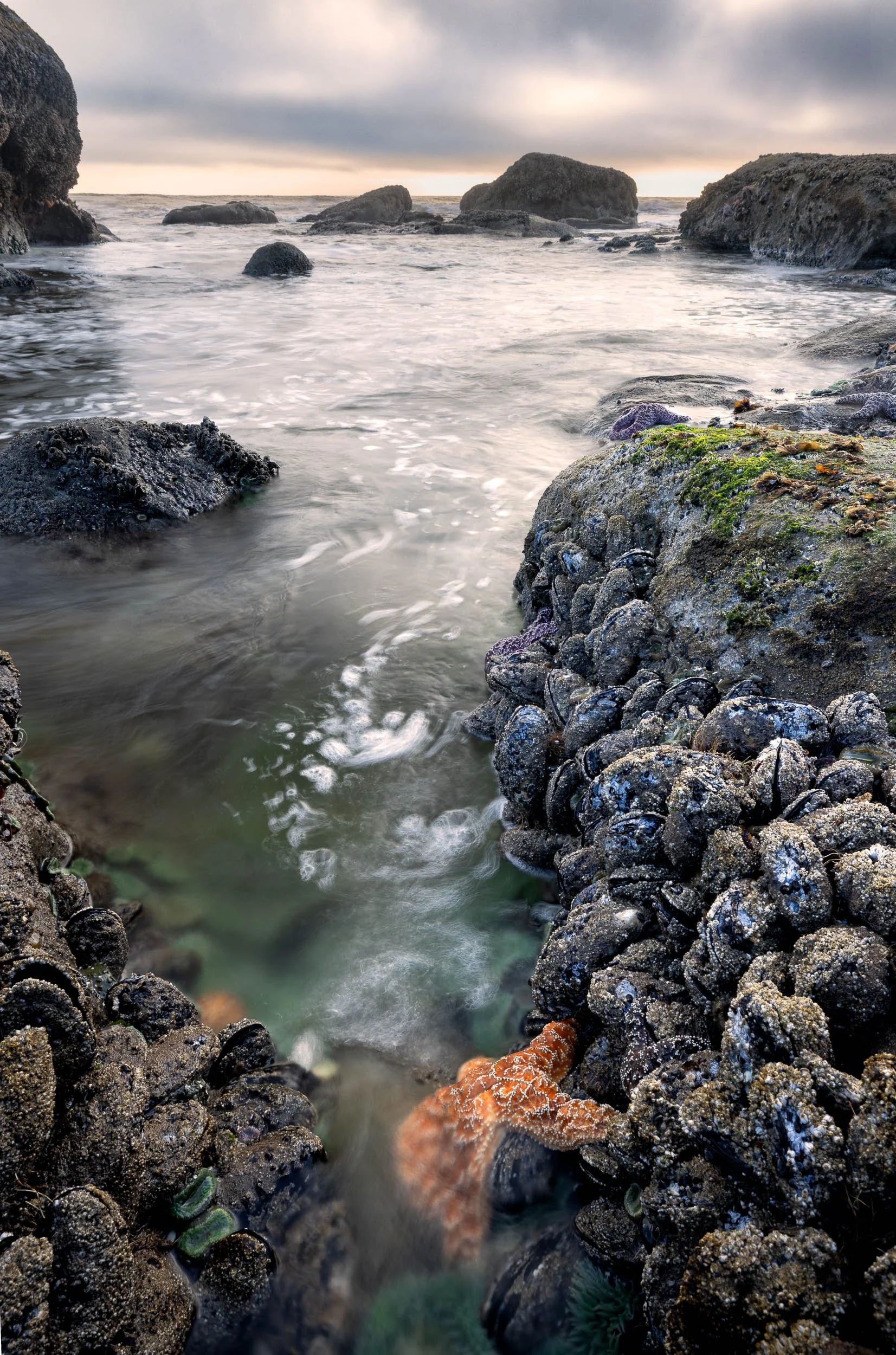
Starfish in tidal pools nearby
When these three differing exposures were combined during the HDR process in Adobe Lightroom, however, the initial result did not fully convey the warmth the human eye had seen. The dynamic range was present deep in the RAW/DNG file, but a lot of the colour atmosphere had been lost. The merged file appeared flatter and cooler than the experience of standing on the beach.
The issue is this: in a similar way to a single image not capturing the full dynamic exposure range while shooting into the sun, the colour tones also diverge to such an extent when making the three bracketed exposures, so that the colour range is also flattened out in the camera. I shoot with daylight white balance, but the camera just cannot give you the full range of colours and so seems to average them out, making yellows duller and blues lighter (Although blues do retain their saturation better than the yellows in this HDR processing). I do not believe that Auto White Balance would get you any further forward, especially when bracketing the exposures.
This is where establishing the correct colour temperature becomes important when editing your images.
Giving colour grading a convincing foundation
There is a temptation to open the Colour Grading panel immediately and begin adding orange to the highlights and blue to the shadows. However, I prefer to establish a believable overall white balance first.
For the Shi Shi Beach image, I increased the colour temperature of the merged RAW file and added a very small amount of magenta with the tint control. This restored some of the warmth that had been flattened during capture and the bracketed exposure-blending process.
The Colour Grading tool can certainly introduce colour, but the result is usually more convincing when it builds upon a suitable foundation. If the file remains too cold, adding orange to the highlights can look as though colour has been painted onto the photograph rather than emerging naturally from the light.
So, only once the overall temperature felt right, did I use the Colour Grading wheels to refine the relationship between the warm and cool areas. I added yellow and orange to the highlights, retained a small amount of pink around the sunset and allowed cooler blue tones to remain in the sea, rocks and deeper shadows.
This balance was important. The intention was not to make the entire photograph warm, but to allow the warm sunset to stand out against its cooler surroundings.
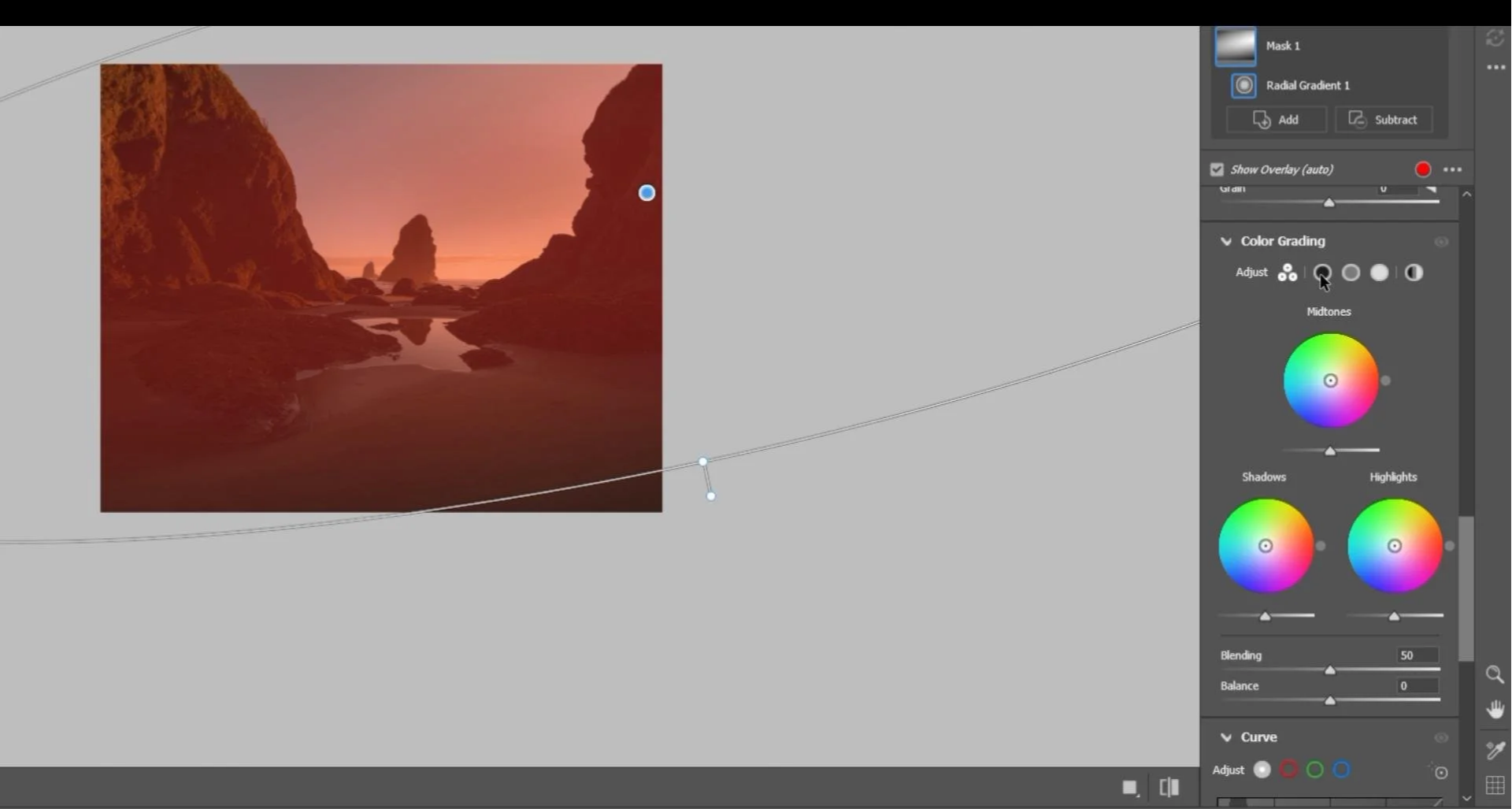
The Adobe version of the Colour Grading tools in PS Camera Raw editor
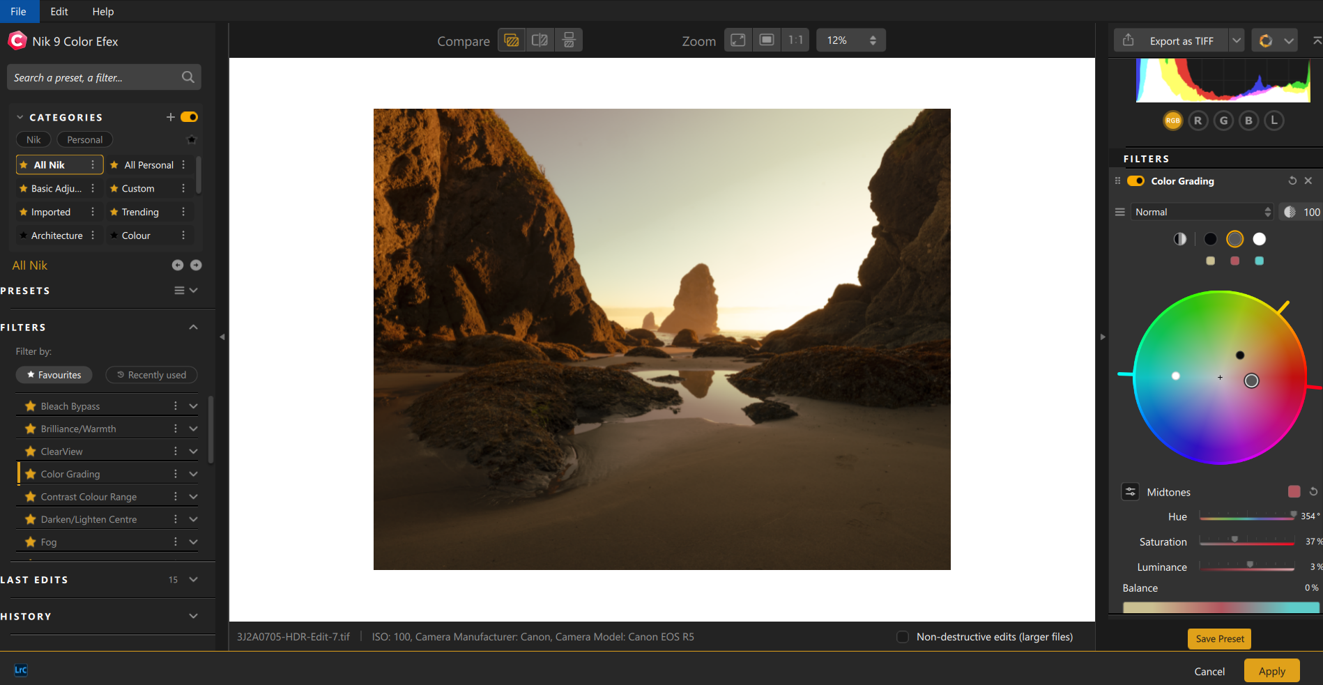
The DxO version of the same thing. Just a slight difference in layout
Video on editing colours. Adventure first half & editing tutorial in the second. Click above to see.
The precise settings are less important than the relationship between the colours. Every file is different, and the amount of grading needed will depend on the light, exposure and starting white balance.
The questions I ask are relatively simple:
• Does the warmth follow the direction of the light?
• Do the shadows remain believable?
• Does the photograph still feel like the place I experienced?
The full editing process, including the local masking, is demonstrated in the accompanying video. For this article, the more important point is that colour grading should strengthen the atmosphere already present rather than invent a completely different one.
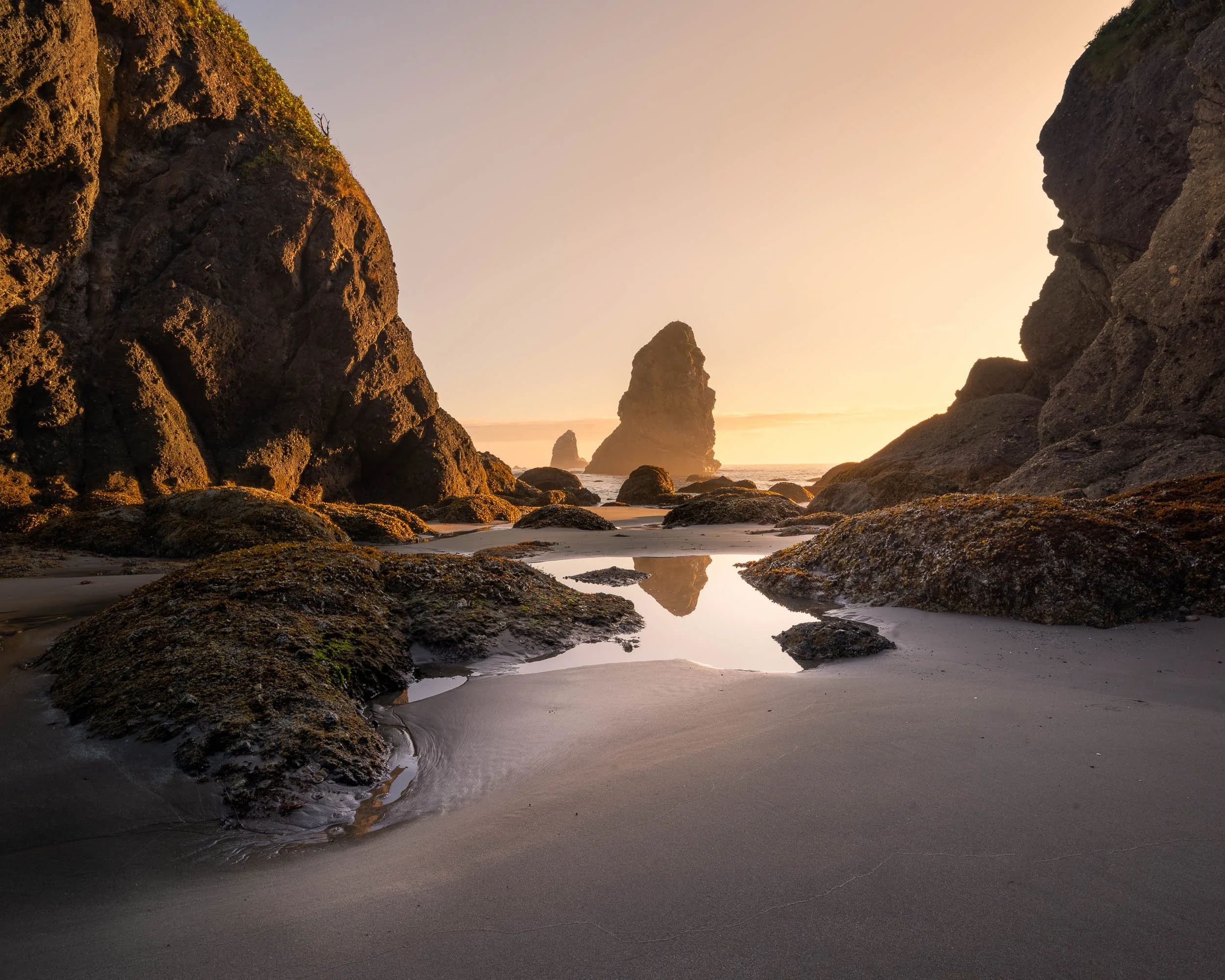
The final warm colour graded version. Three exposure bracketed images into a single HDR file, Then colour temperature adjusted and followed by Colour Grading to balance the blues and yellows/oranges.
The opposite approach: embracing blue
One of my other favourite photographs from the trip was made during a very different kind of sunset.
There was no dramatic orange light breaking below the clouds. Instead, the coast was covered by mist and heavy overcast conditions, giving the scene a cold, quiet and slightly sombre atmosphere.
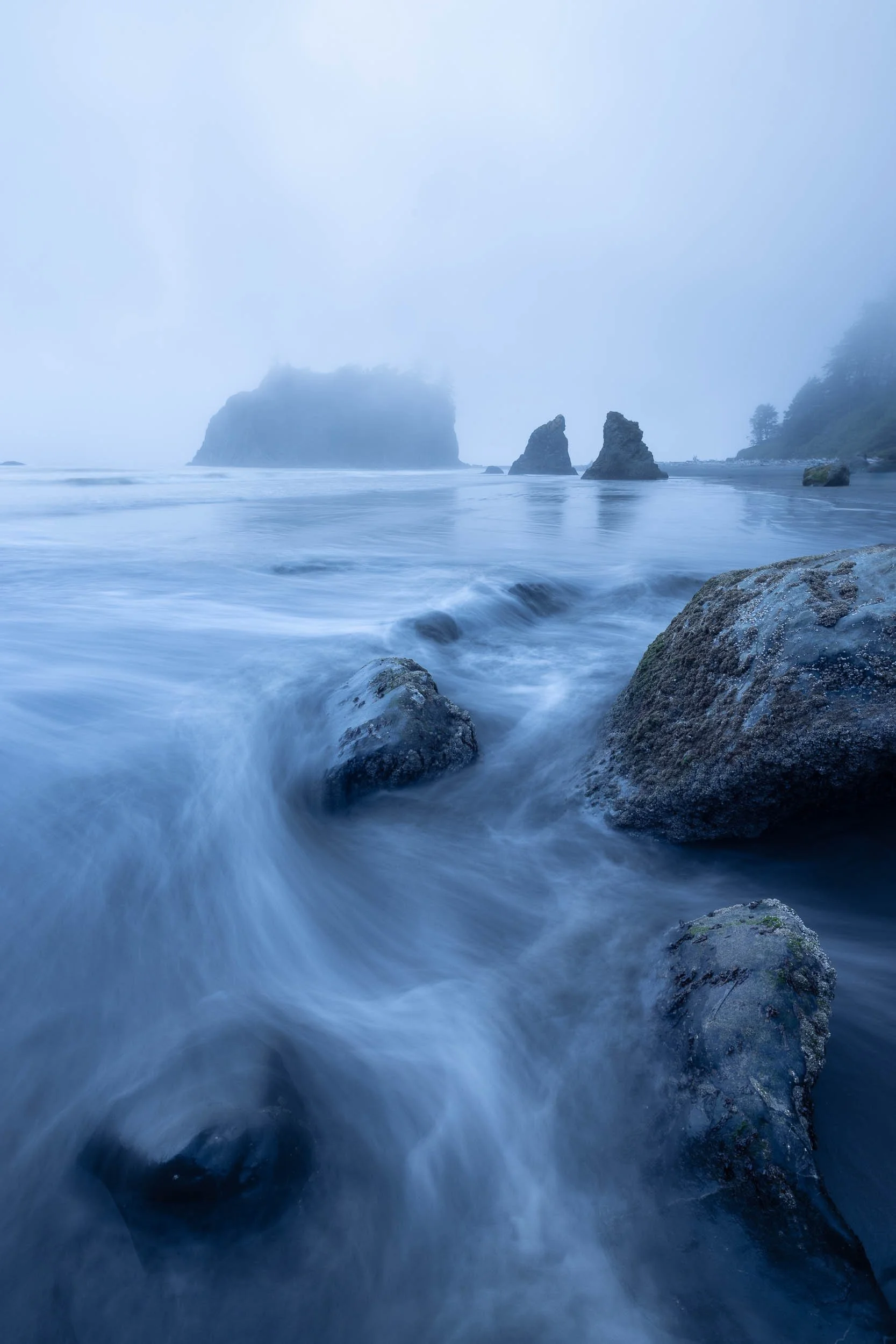
Olympic Park Coast as it is often found. Overcast and shrouded in fog
Because I was using Daylight white balance, the photograph came out distinctly blue.
It would have been easy to treat this blue as a technical problem. I could have increased the colour temperature, neutralised the cold cast and attempted to recover the appearance of a more conventional sunset.
That might have produced a warmer and more immediately attractive photograph, but it would not have represented how the scene felt.
Instead, I moved in the opposite direction and allowed the blueness to become part of the image’s identity.
Blue can communicate coldness, distance, stillness, isolation or melancholy. In this photograph, those qualities were not defects to be corrected. They were central to the atmosphere of the scene.
I enhanced the cold palette but retained some variation within it. The deep water and deeper shadows could remain blue, while the rocks and white water were allowed to stay slightly more neutral. This prevented the image from becoming one undifferentiated block of colour.
The warm Shi Shi Beach photograph and this overcast coastal image are almost opposites. One is driven by warmth, energy and luminous colour. The other depends on restraint, coldness and stillness.
I find them equally successful.
This contrast demonstrates why there is no single correct colour temperature for landscape photography. White balance is not simply a process of making neutral objects appear neutral. It can also determine the emotional language of the photograph.
The correct decision is the one that supports the experience you are trying to communicate. An important tip here: Shoot RAW and you can always choose the colour balance when you get home. Shoot JPG and you get what you get.
Green light in the Hall of Mosses
Moving from the coast into the Hoh Temperate Rain Forest felt like entering a completely different colour world. At the Hall of Mosses, great curtains of moss hung from the trees and the light filtered through layers of green, yellow and blue. The forest felt damp, enclosed and almost luminous.
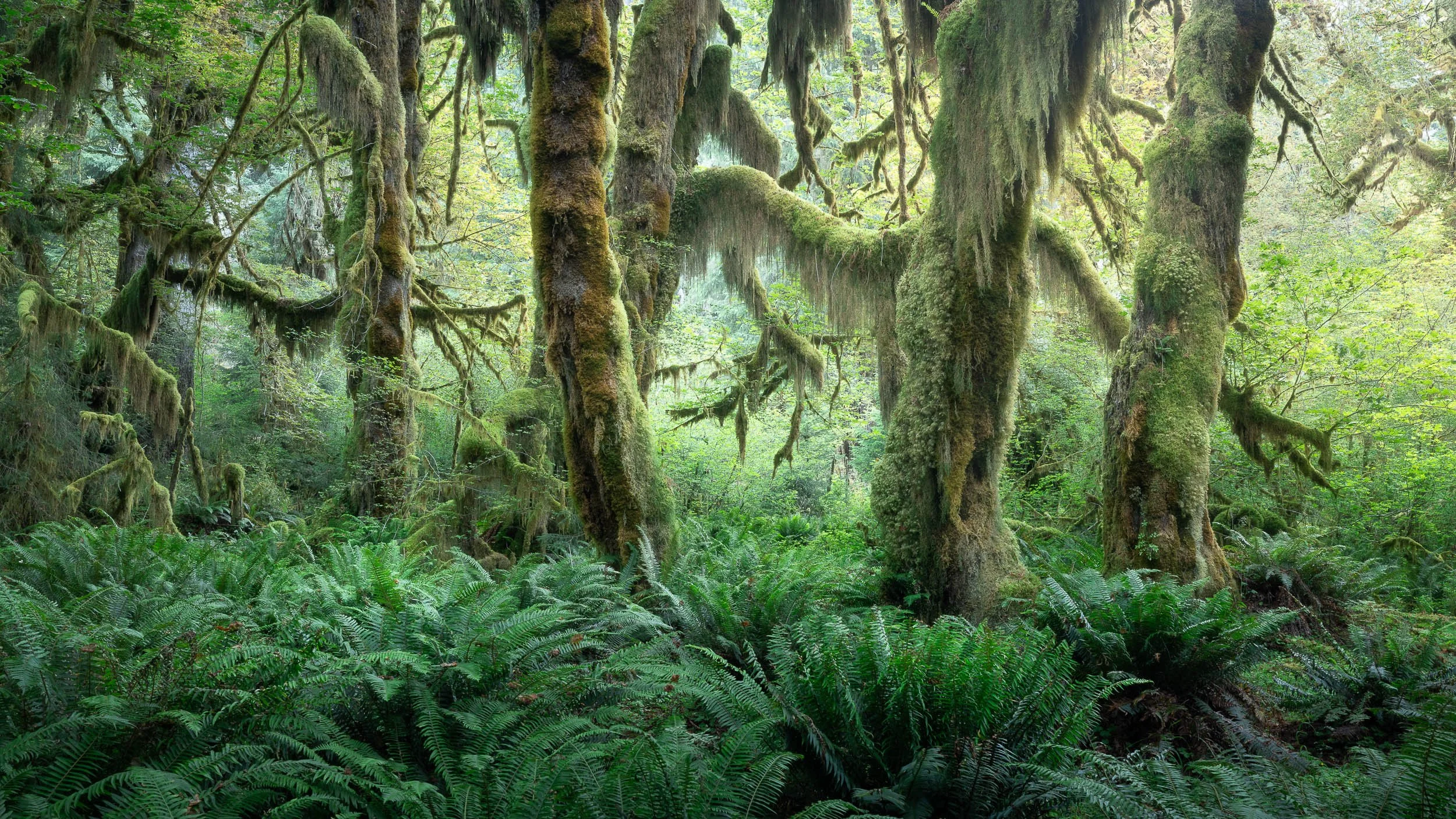
The dancing mosses in the Hoh Temperate Rain Forest, Olympic National Park, WA
Woodland colour can be difficult because the camera is surrounded by reflected green light. If everything is allowed to merge into the same heavy shade, the atmosphere and depth of the forest can quickly disappear.
My camera settings help me see a useful impression of those colours on the rear screen while I am working. I normally use Daylight White Balance and photograph in RAW, but I have included my camera settings PDF with this article for anyone who would like the fuller technical explanation.
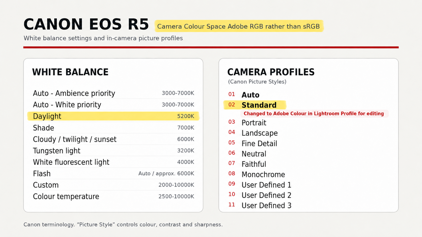
This is how I get the correct colour on the back of my camera. Adjust as you feel fit to prevent getting overwhelmed with mushy colours in woodlands
For me, the more important part was responding to the experience of being there. I looked for the warmer yellow-greens where sunlight reached the moss, cooler greens within the shadows and occasional tree trunks that gave the eye somewhere to rest.
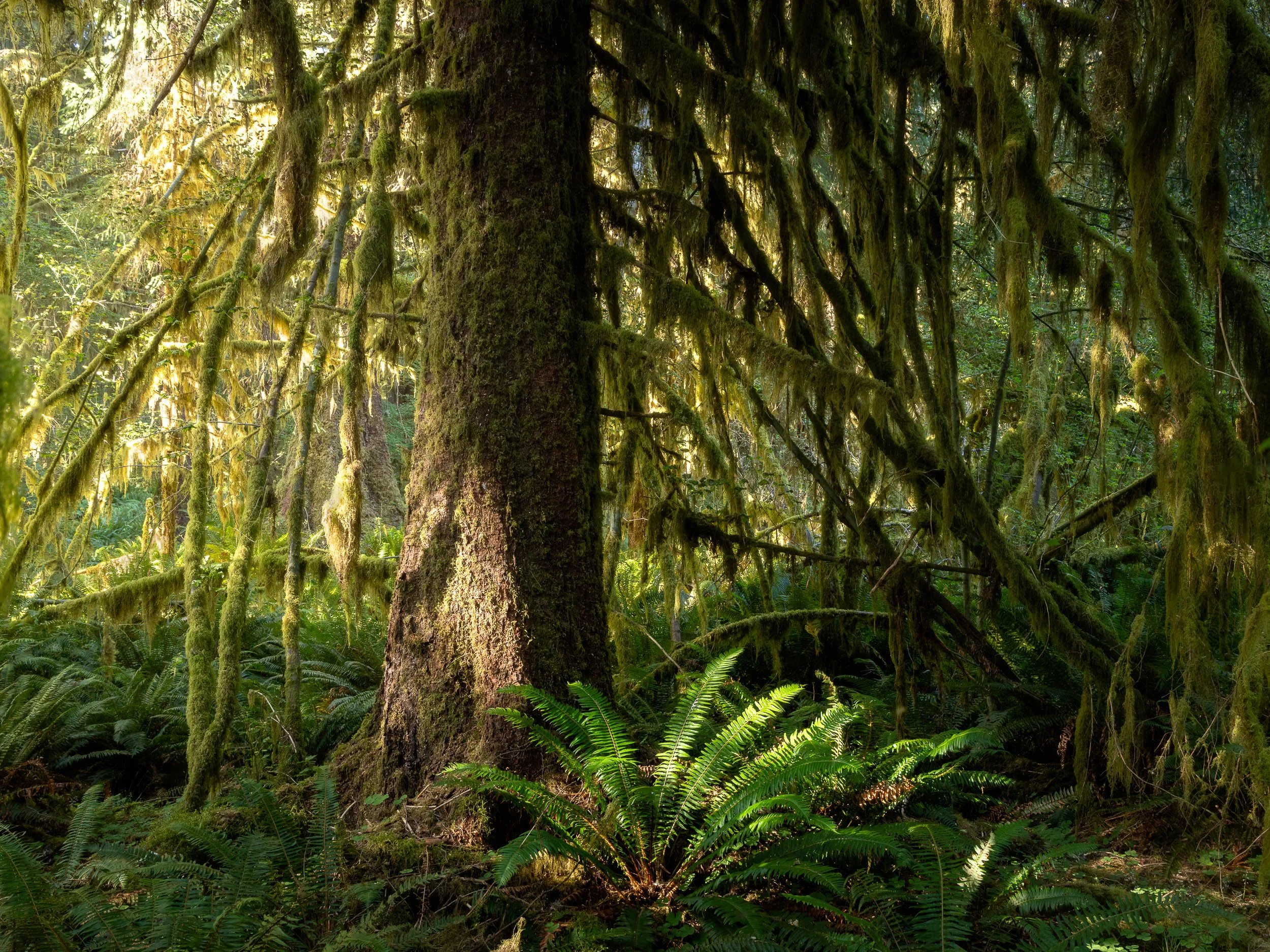
Yellows and greens of the Hoh Forest
The most successful compositions were not necessarily those containing the greatest amount of colour. They were the ones in which the light created a route through the vegetation and gave some order to an otherwise overwhelming forest. So it is the luminosity of the colours that becomes important. Brighter greens are more yellow and darker more green/blue. This creates the depth you see in these images. Hopefully then you can see how important colour temperature balance is to being able to see and create these compositions
The editing remained deliberately restrained. I protected the brightest areas, encouraged the natural direction of the light and allowed the greens to retain their differences. The aim was not to transform the Hall of Mosses, but to preserve the strange, enveloping atmosphere that made it so memorable.
The accompanying video above provides a closer look at the editing process.
When the colour has gone
The fire-damaged forest presented the opposite challenge.
In the Hall of Mosses, I had been trying to control an abundance of green. However, when we stumbled upon an area in the park devastated by a wildfire in 2025, much of the colour had disappeared.
Blackened trunks, pale ground and damaged vegetation created a landscape that was already close to monochrome. The surviving trees formed stark, repeating patterns, while the loss of the canopy made the forest feel exposed and unfamiliar.
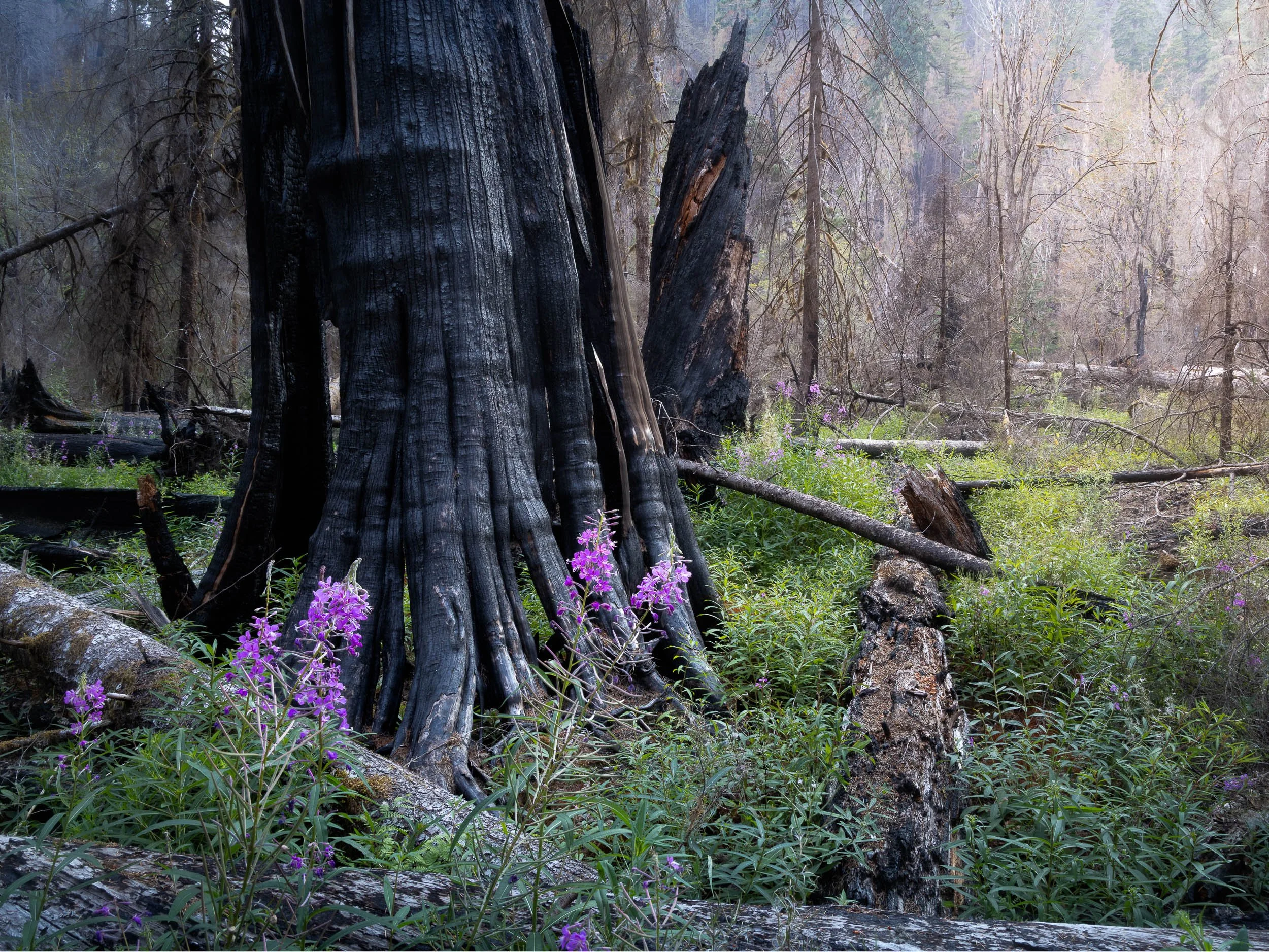
Wildflowers grow amongst the devastation of the 2025 wildfire a year later
For some of these scenes, I used my infrared-converted Canon EOS R and worked entirely in black and white.
Infrared suited the landscape because it concentrated attention on form, repetition and texture. It also introduced a slight sense of unreality, which seemed appropriate in a forest that had been dramatically transformed.
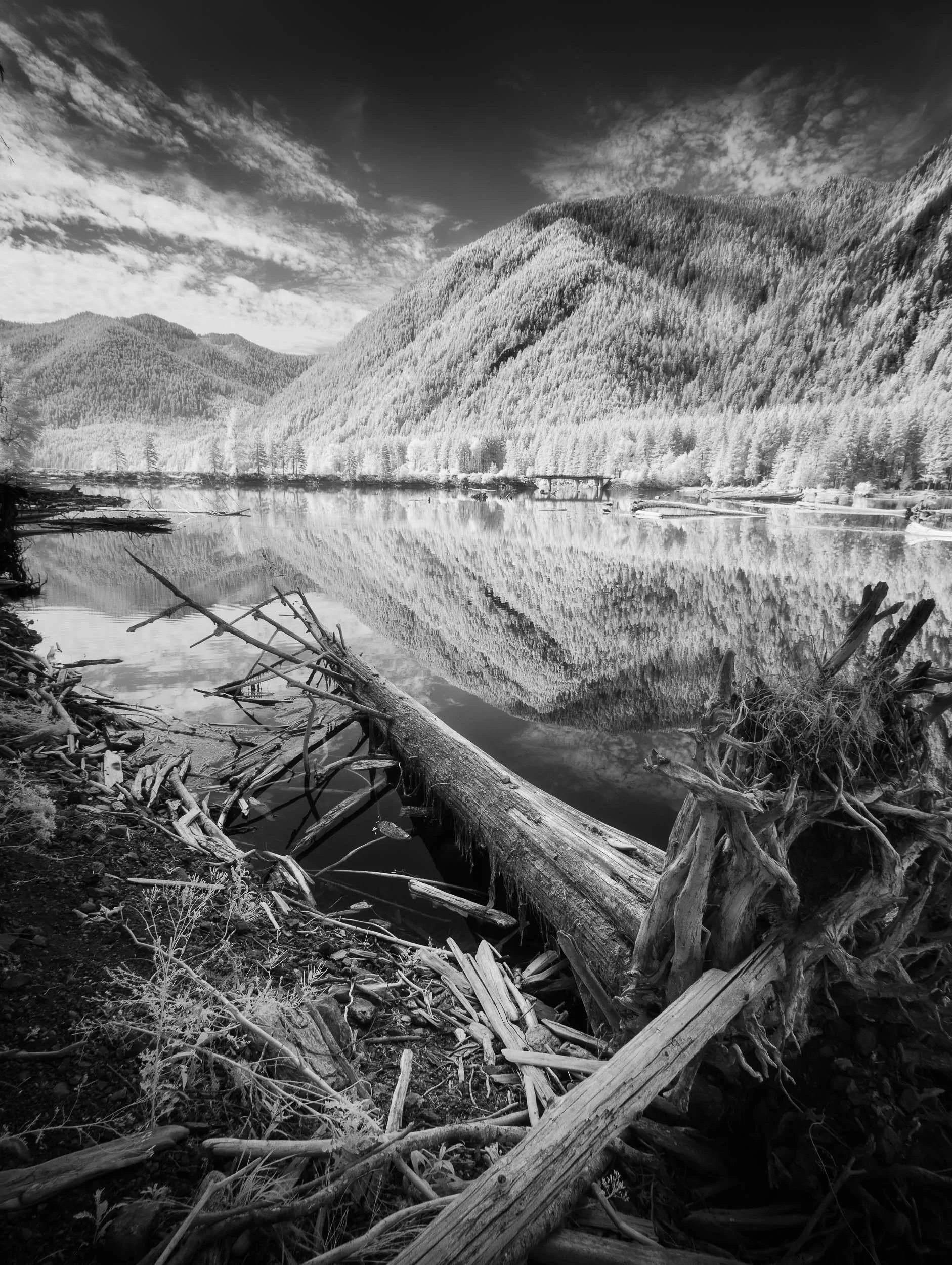
Fire damaged trees float into the lakes in Olympic National Park. Infrared camera used
I also photographed the area in colour with my Canon R5. With these images, I resisted the temptation to force colour back into the landscape.
The muted palette was not something that needed to be repaired. It was part of the story.
The charcoal trunks, pale earth and subdued remnants of vegetation were allowed to remain dominant. Against this near-monochrome landscape, the smallest appearance of colour became significant.
Among the burned trees were occasional patches of pink wildflowers.
In a lush meadow, the same flowers might have become just one more area of colour. Here, surrounded by blackened trunks and damaged ground, they became visually and emotionally powerful.
Their effect came from scarcity.
The flowers did not need to fill the frame. A small crop of pink was sufficient to draw the eye and alter the meaning of the photograph.
Without them, the image might speak mainly about damage and destruction. With them, it begins to suggest survival, recovery and the gradual return of life.
This is where less can be more in colour photography.
We often associate successful colour photographs with richness and saturation, but colour can be at its most powerful when used sparingly. A small accent can carry more visual weight than an entire frame filled with competing hues.
The burned forest did not need more colour. It needed the little colour that remained to be noticed.
Warmth, coldness, abundance and absence
Looking back at the trip, many of the photographs seem to fall into four distinct colour experiences.
The Shi Shi Beach sunset is built around warmth. Yellow, orange and pink light are balanced against cooler areas of sea, rock and shadow.
The overcast coastal photograph embraces coldness. Its blue palette communicates stillness and atmosphere rather than trying to imitate a conventional colourful sunset.
In the Hall of Mosses, colour was everywhere. Layers of green foliage, yellow-green moss and occasional shafts of warmer light created a landscape almost overwhelmed by colour. Here, the challenge was not adding more, but finding enough separation within the greens and yellows to reveal the shapes, textures and atmosphere of the forest.
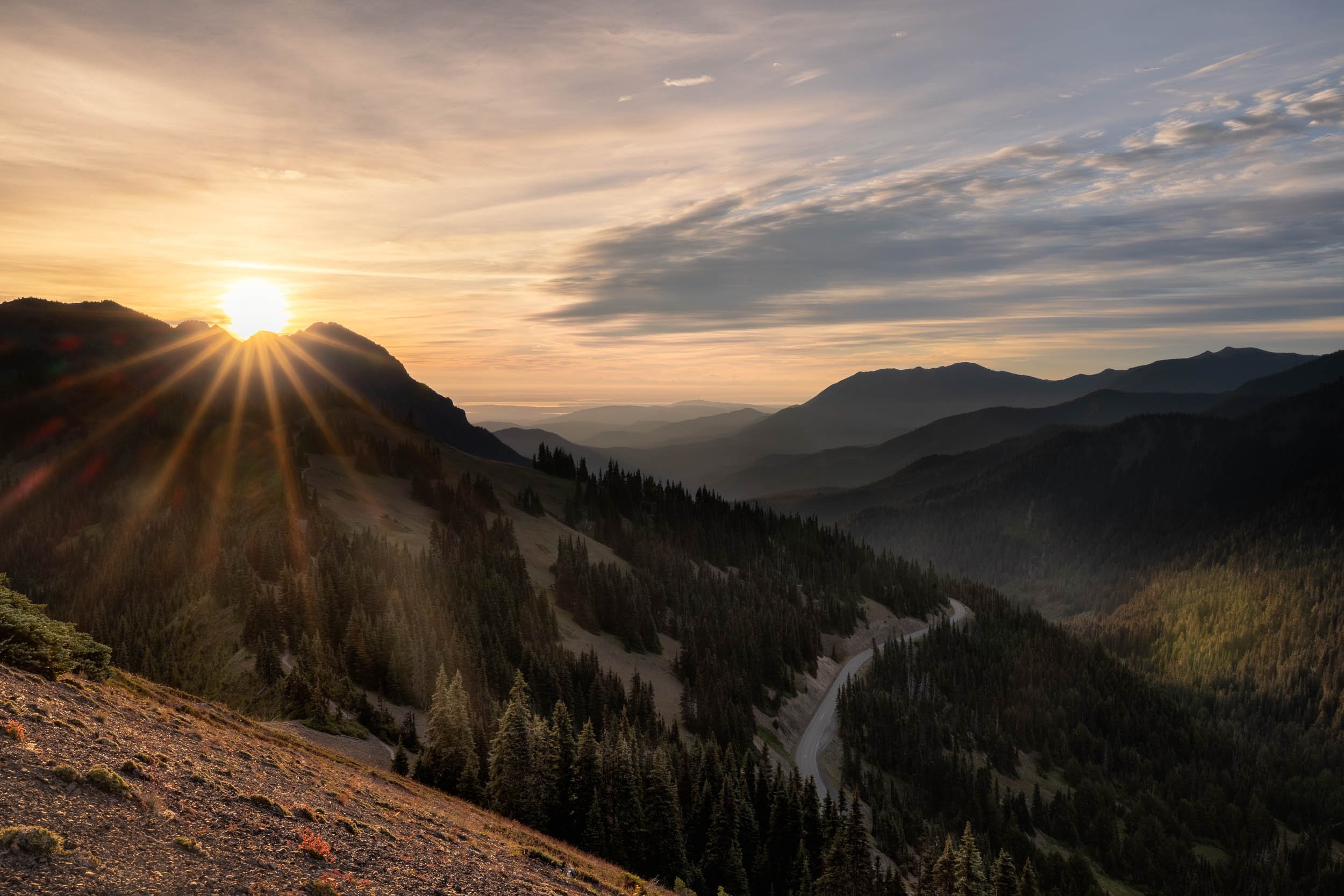
Hurricane Ride at sunrise
The burned forest explores the near absence of colour. Infrared removes colour completely, while the Canon R5 photographs allow a small amount of pink to stand against an otherwise muted landscape.
None of these approaches is more correct than another.
White balance and colour grading are not simply ways of making a photograph warmer, brighter or more colourful. They are ways of deciding what matters within a scene and how the viewer might experience it.
Sometimes that means restoring the glow of a Pacific sunset. Sometimes it means allowing an overcast coast to remain cold and blue. In the living rainforest, it can mean controlling an abundance of green so that the atmosphere is not lost within it. Occasionally, it means accepting that the colour has almost disappeared and recognising that a small patch of wildflowers can say more than a whole landscape saturated with colour.
For me, successful colour photography begins with deliberate camera settings in the field, but the final decision is less technical.
It is emotional.
I would be interested in hearing anyone else’s views on mastering white balance. There can often be quite a bit of controversy and disagreement on the right way to do it. Please comment below, and I will reply.