
Black and White Photography Pictures as Wall Art
From landscape and city scenes to gallery-ready wall art, this guide explains when and why fine art black and white photographers choose monochrome.
Black and white photography pictures have long been used as wall art to simplify complex scenes, emphasise structure, and communicate mood in a way colour often cannot.
Black and white photography pictures have a unique ability to strip a scene back to its essentials. Whether displayed as wall art black and white prints or just studied for their structure and tonality, monochrome images often communicate mood and meaning more powerfully than colour.
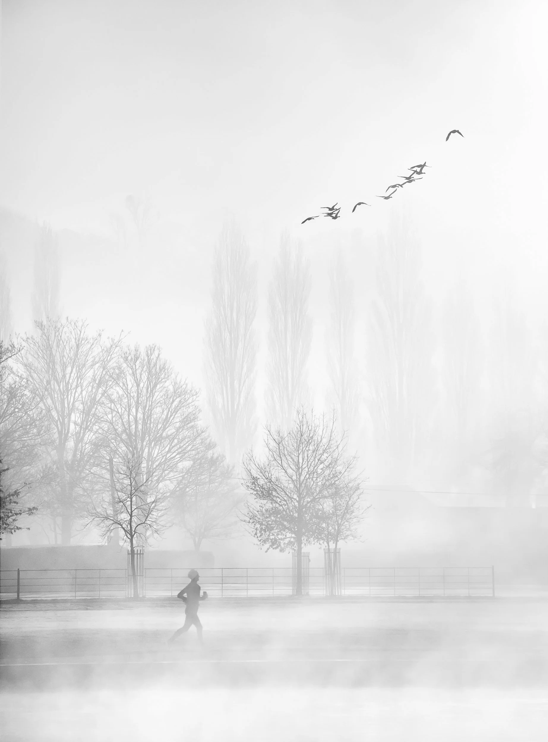
Runner at Dawn - B&W simplifies the elements here. This is one of the rare occasions I have shot as colour and decided later to convert to B&W. Normally, the intent is to create a B&W image from the outset.
This article was inspired by the December issue of Elements Magazine, which focused heavily on black-and-white photography, particularly in winter conditions. Despite its long history and enduring appeal, monochrome landscape and city photography remains underrepresented in competitions and online galleries when compared to colour work. That imbalance made me reflect on why I return to black and white so often in my own practice.
For me, black and white is a deliberate creative tool. It allows me to simplify complex scenes, remove colour distractions, and emphasise light, form, texture and structure. These are the foundations for strong visual storytelling. Whether I am photographing woodland in England, coastal landscapes in Scotland, or urban environments, monochrome helps me create images that are calm, graphic and intentional.
In this article, I’ll explain why I choose black and white, what makes a strong monochrome image, when conditions suit it best, and how I create my final photographs. I’ll also touch on my printing workflow and the photographers who have influenced my approach as a fine art black and white photographer.
Why Black and White?
Black and white is far more than a stylistic choice. It is a way of stripping a scene back to its essential components. Colour can sometimes dilute the emotional impact of a photograph or distract from the elements that actually matter.
This is why many of my black and white photography pictures are created with a final print in mind, particularly as wall art black and white images where simplicity and tonal balance are essential.
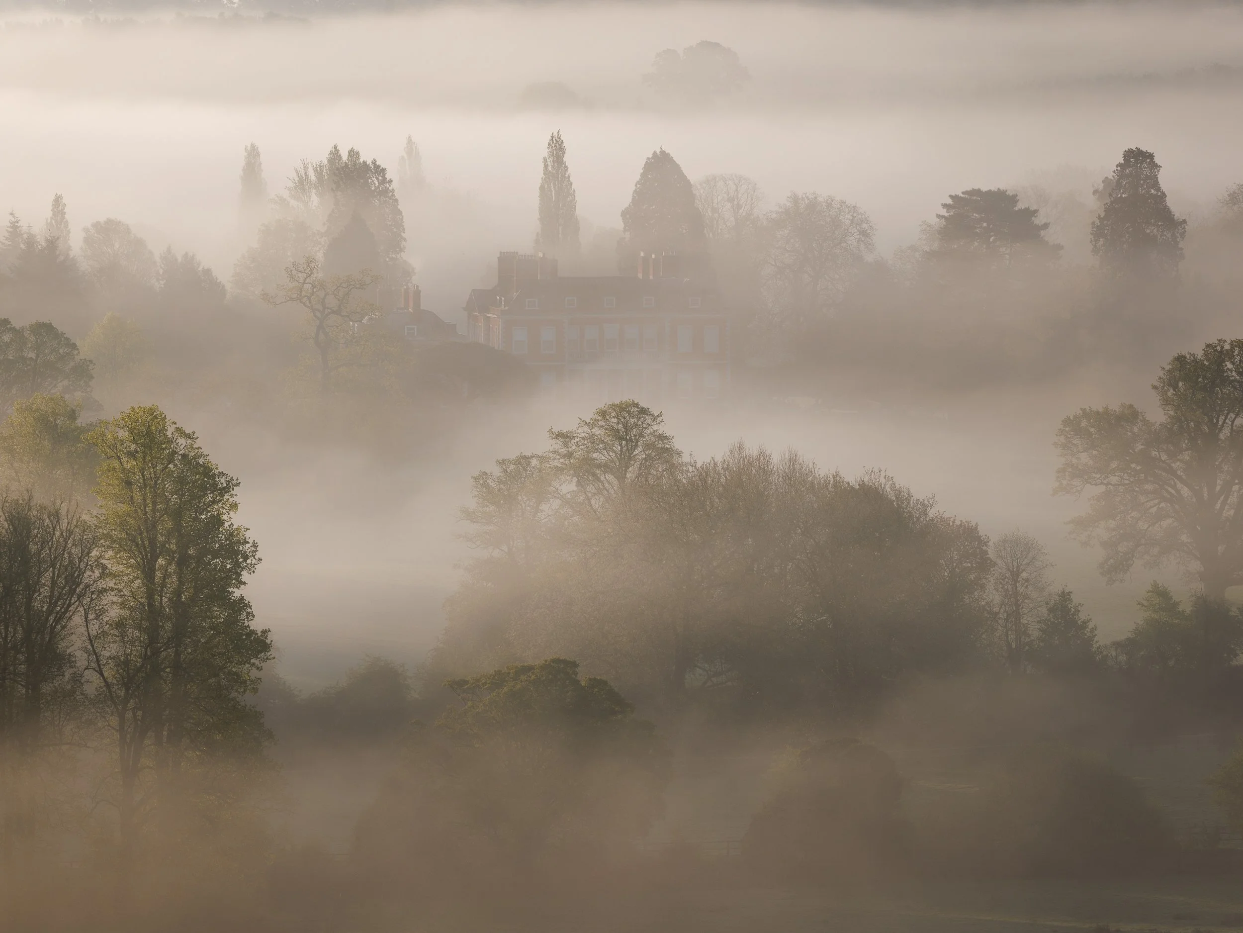
If the colour in an image is not bold, but instead contains a pallet of muted pastel colours, with little form and texture, the images will generally lack impact unless these tones are used for an emotional response. (An example of where the delicate muted colours may work emotionally would be a misty woodland.)
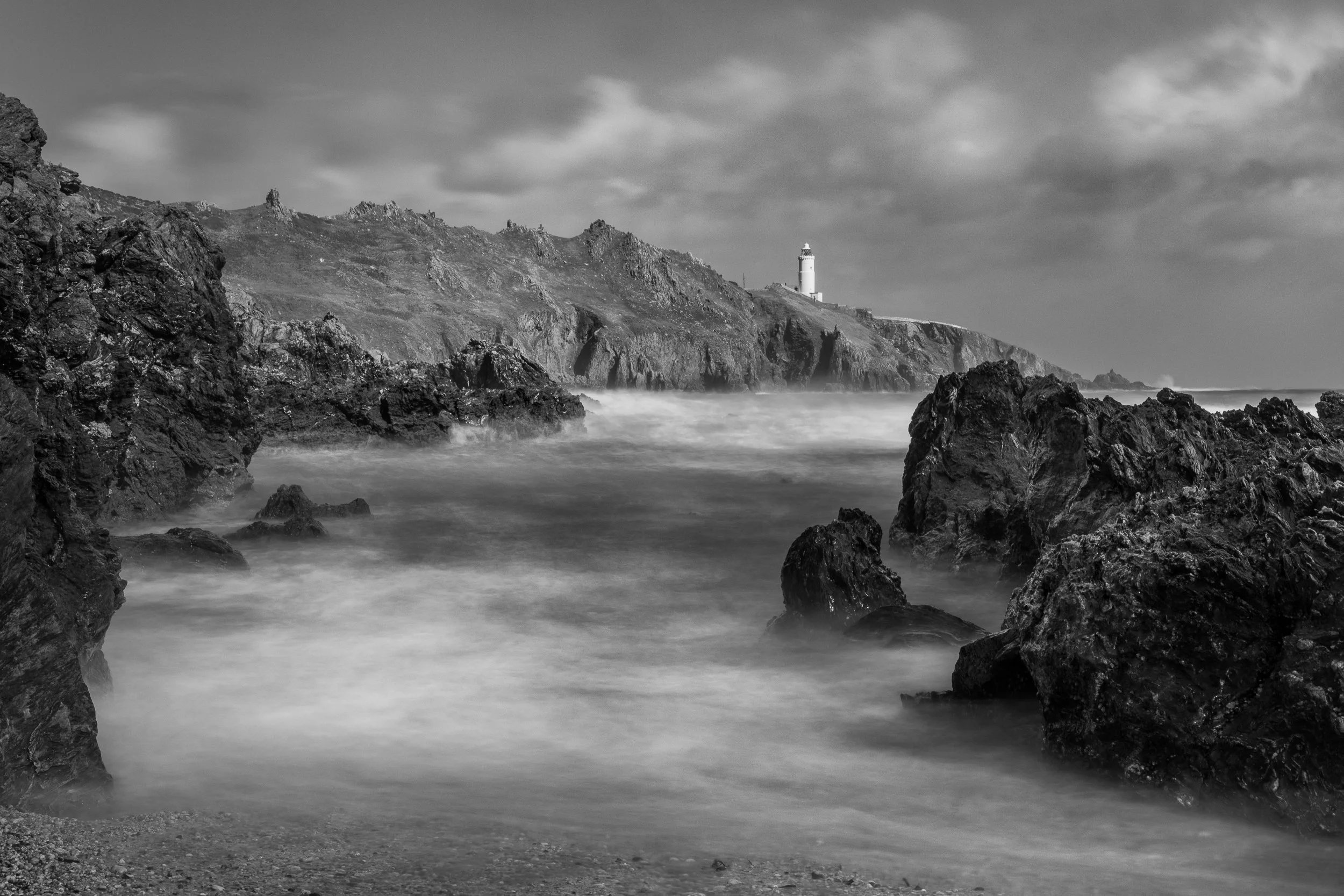
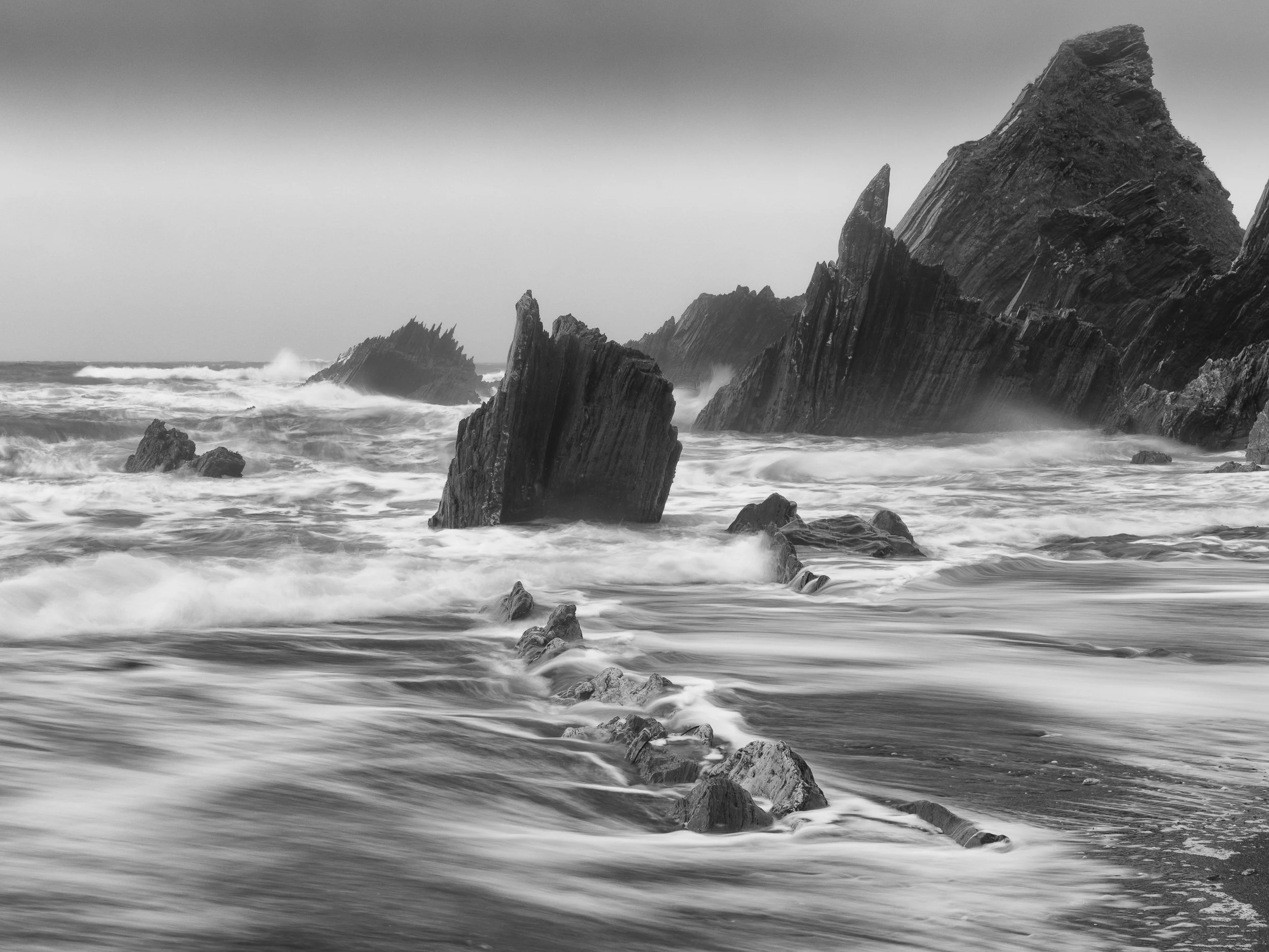
Start Point, Devon - high dramatic contrast. A dynamic atmosphere
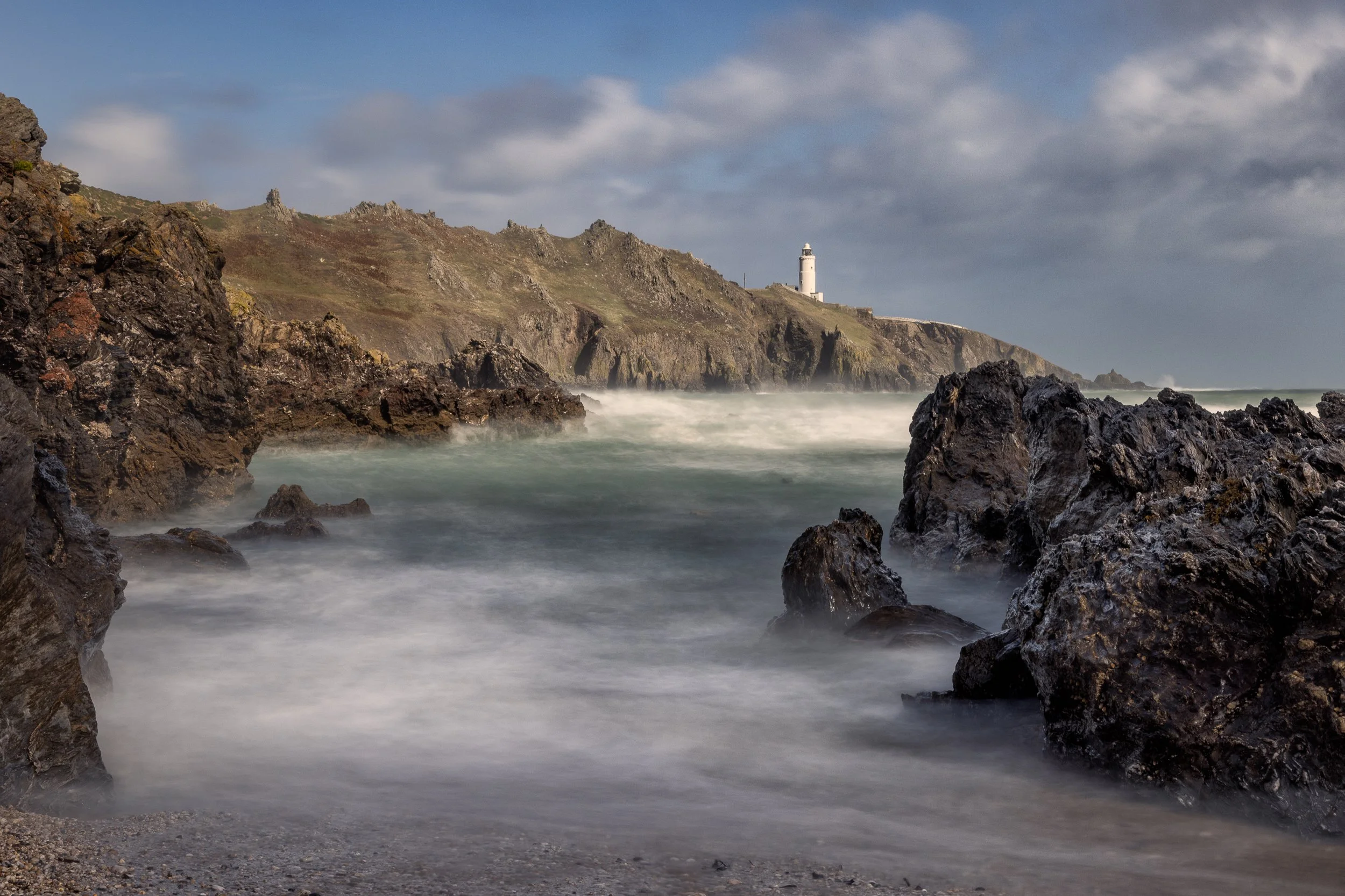
Start Point, Devon - with pastel colours - A calmer atmosphere despite the raging sea
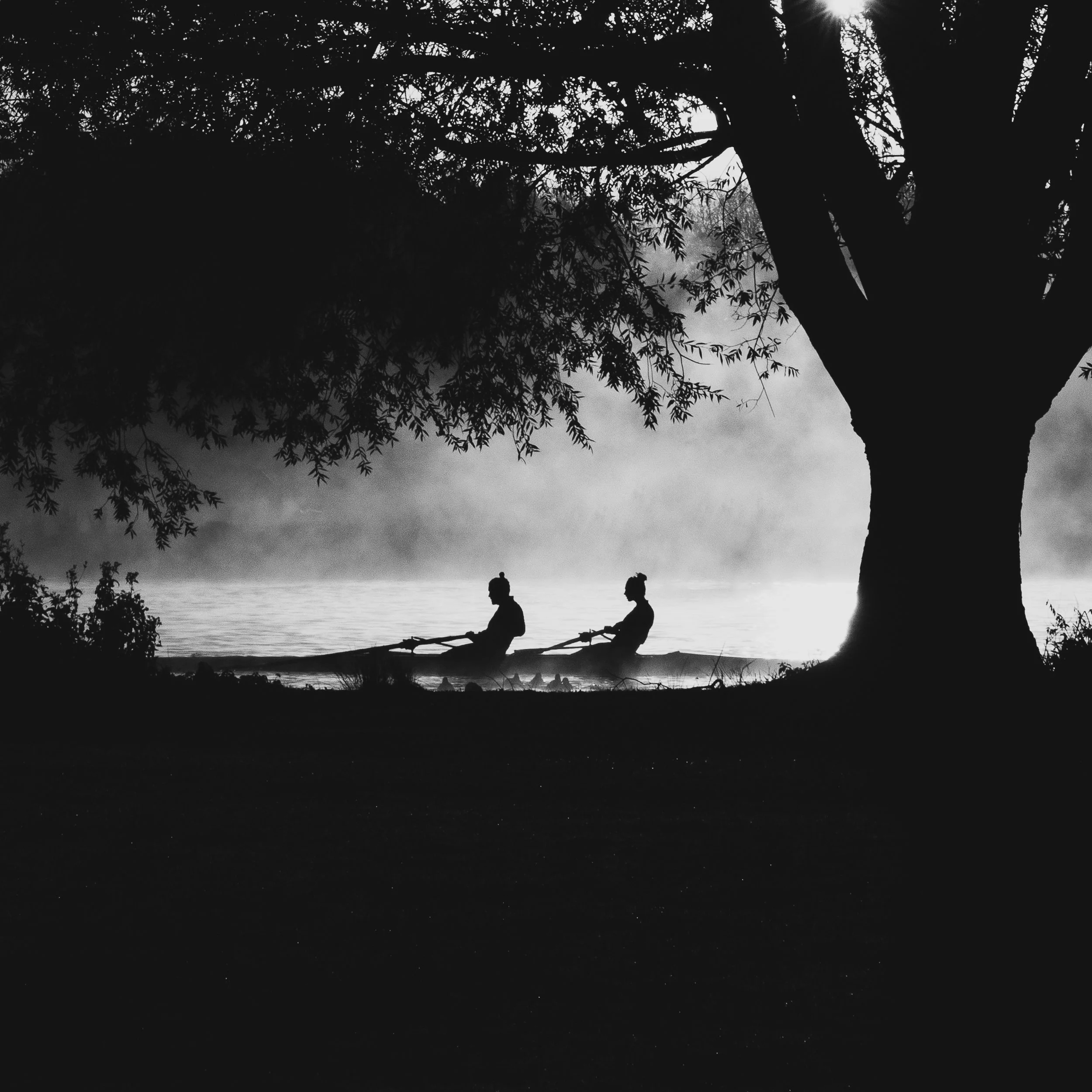
Rowers at Dawn. It is obvious what the subject is.
What happens when I remove colour?
The Impact increases: strong tonal contrast replaces competing hues.
The scene simplifies: composition, shape, and light become clearer.
Key elements stand out: textures, lines, patterns, shadows, and atmosphere.
Whether it’s a woodland, a windswept coastline, or a busy street, monochrome allows me to focus the viewer’s attention exactly where I want it. Without colour, the eye reads the scene differently. It becomes about mood, structure, and storytelling.
Relationships of colour to monochrome tones.
It is important to understand that there is often a strong link between colour and Black and White images. This link is the contrast between the colours.
In bright light, colour becomes more saturated. A blue will become much darker than a complementary yellow compared to that of an overcast or low-light situation. Generally, a colour such as green would be deemed to be 18% grey. This is your mid-grey. But if you meter the exposure for a normal exposure and then increase or decrease the brightness, this and other colours will change their contrast levels, making some colours darker and some lighter. So, where you have contrasting colours, it is worth altering your exposure in camera to make some of these tones darker and more impactful. It sounds a bit confusing, but I suggest that on a bright day you adjust your exposure compensation by -1 or -2. When you do this, not only might your colours become more impactful, but your dark tones for a B&W image will look better against the lighter tones. (see the images below)
18% grey of the building is darkened/dramatised using an exposure compensation of -2 (The blackness of the blue sky, has been enhanced in post editing)
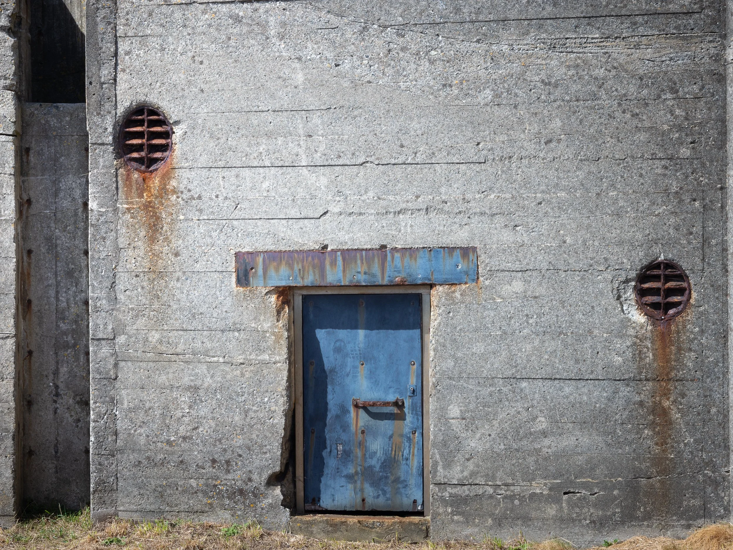
The blue here can be seen in this version. Bright sunlight and shadows on the blue enhance this door when finally converted to B&W.
The Weather
Sometimes the colour in the scene is completely washed out and B&W is the only way to go. For me, this happens particularly in two scenarios.
1) The weather is so appalling that all colour is washed out of the scene.
2) The weather is very bright, but in a landscape devoid of significant colour. For example, pastel colours in a sweeping vista landscape where every colour seems to merge. We have often seen this with our family holiday picture snap shots. Great holiday, great weather, but get those images back and the family look great but the scene behind just looks washed out.
So, at these points, I often switch to B&W. There is a mental switch in me that then starts to hunt for the tonality, contrasts and forms in order to create a more simplified image.
Storms on the South Devon Coast. What was the point in keeping this as a colour image? It was devoid of colour in the first instance…but not drama!
What makes a strong monochrome image?
A successful black-and-white landscape or city photograph relies on a few core ingredients. Because colour is removed, tone becomes everything.
Great black-and-white images often have one or more of the following:
Strong contrast
Bright highlights and deep shadows work beautifully in monochrome.
Isolation of the subject using contrast and tones
High-key or low-key tonality
High-key: bright, airy images with soft shadows.
Low-key: dark, moody scenes with pockets of light.
A clear subject or area of interest
Black and white is perfect for isolating forms within the landscape. Examples:
Rocks on a shoreline
Waves breaking against cliffs
Stark trees in winter
A single architectural line or building
Birds silhouetted against a bright sky
Tonal separation
Different elements need different tones to prevent a muddy image. You want distinct layers and a sense of depth.

A deeper more dramatic image using tonal separation like in Ansel Adams Zone System.
The image holds its own in colour, but once again, there is a significant difference in feel, atmosphere and depth.
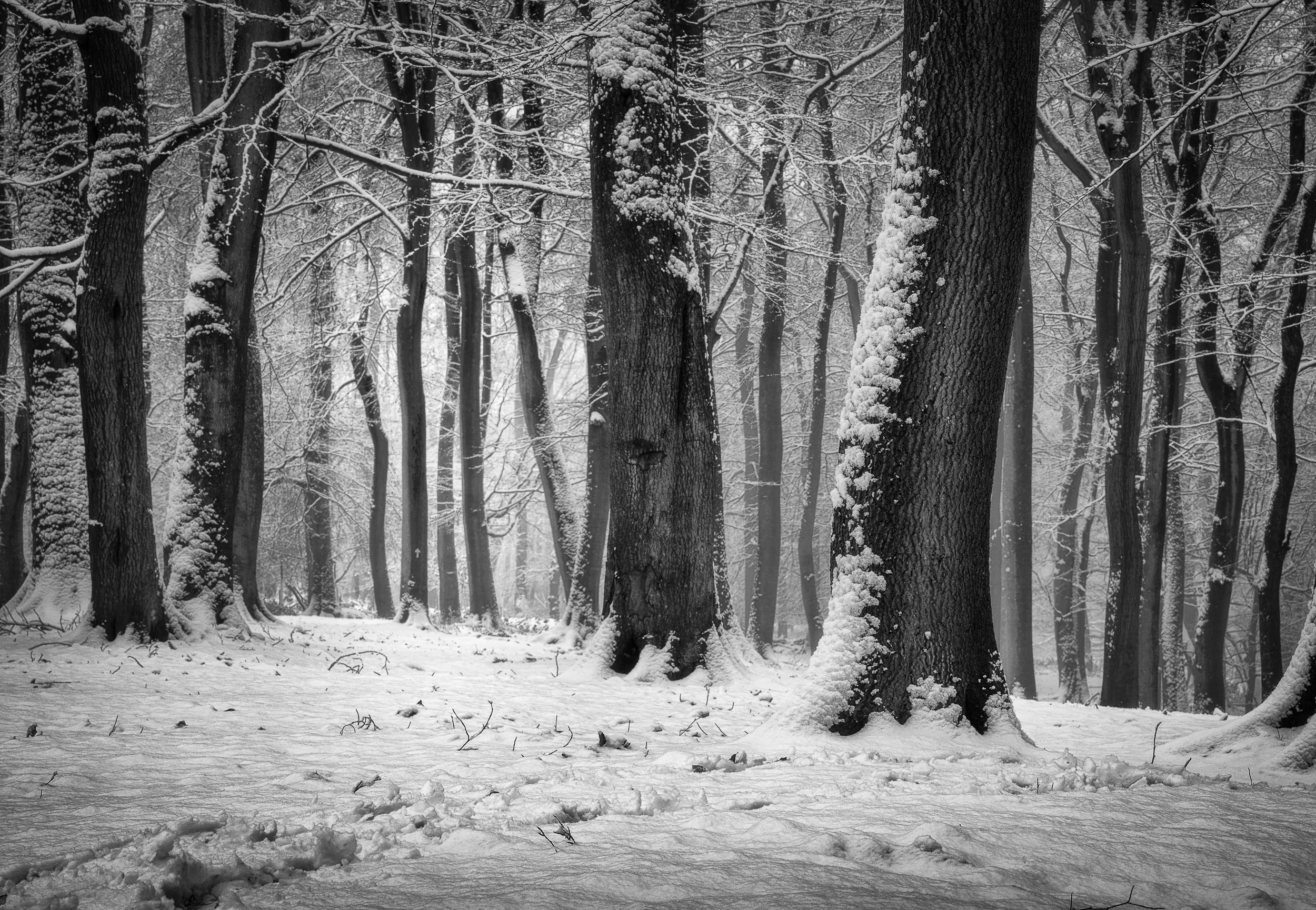
Winter snow and woodlands or trees. Its a no-brainer for B&W
When to Shoot Black & White
Certain conditions naturally lend themselves to black-and-white photography and we have discussed this previously in this article. However, it is at these times that I instinctively switch to thinking in monochrome.
• Winter weather
Snow on mountains, rocky slopes, or tree branches creates natural contrast. The interplay between white snow and dark stone or woodland trunks is ideal for monochrome.
• Bright, directional light
Harsh sun, normally difficult in colour but as discussed before can work brilliantly for B&W. I emphasise at this point that this type of light with B&W works brilliantly for city and street scenes, creating bold shadows and graphic compositions. In mid-summer I will often head to central London with my B&W head on. Sometimes I travel there with only one analogue camera loaded with black and white Ilford HP5 of Delta film, that I will later develop myself.

Scorching hot bright afternoon in Spain. Making the most of the harsh shadows.
Ideal landscapes for monochrome
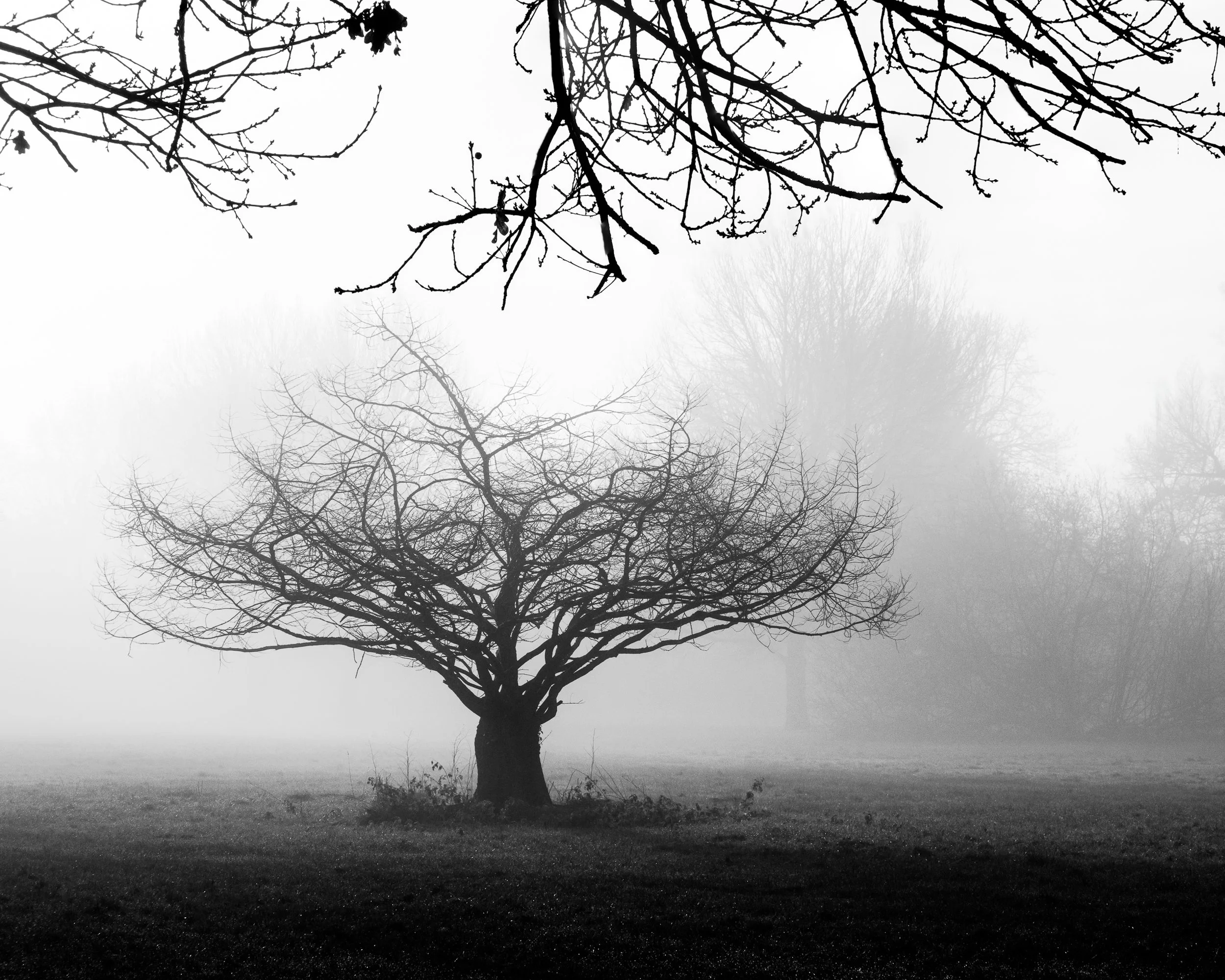
• Mist, fog, and low contrast
These conditions reduce colour saturation and create a soft, dreamy monochrome mood with beautiful tonal transitions. These conditions also work well in colour.
• Coastal scenes
Dark rocks against white waves, long exposures, and textured skies often tell a stronger story without colour.
• Urban environments
Glass, steel, concrete and shadows naturally create geometric contrast perfect for black and white. It is worth enhancing the tonal rang dramatically in post editing for these images to work well.
In short: choose black and white when the light, textures, and structure of the scene matter more than the colour.
How I Create My Black & White Photographs
My process is a combination of in-field intention and post-processing decisions.
1. Convert using Lightroom or DxO Silver Efex
I usually begin in Lightroom. I create the tonal range I require in colour first. This allows me sometimes to separate the colours and tones more before I then convert the image to black and white to see how the tones look before going further along the road to a deeper more impactful range of tones. For more refined control, I often use DxO Silver Efex, which allows precise manipulation of tonal regions and film-style rendering. However, if I have managed to nail the shot in camera, I may not venture out of Adobe Lightroom which has excellent B&W credentials as well. My style often results in deep rich darks and bright whites (but just short of being blown out in the highlights.)
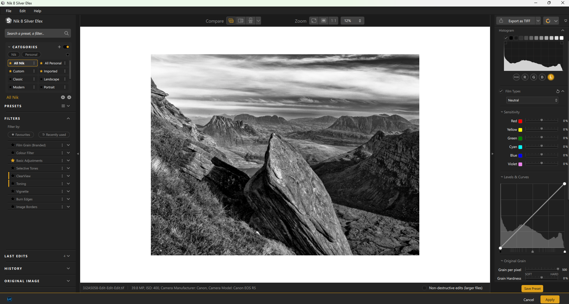
DxO Silver Efex software used in conjunction with Adobe Lightroom and Photoshop
2. Curves and tonal control
Curves are the heart of black-and-white editing. I use them to:
Deepen shadows without crushing detail
Brighten highlights while protecting texture
Create an elegant, controlled tonal transition
This goes back to the Zone System, developed by Ansel Adams, which encourages you to manage where the darkest blacks and brightest whites sit. The goal: rich blacks, luminous highlights, and a full tonal range without losing subtle detail. The DxO Silver software has a histogram that highlights the tones into zones similar to how Ansel Adams used his Zone System. My best images come when using this tool to make the final tonal adjustments.
3. Dodging and burning
Light shaping is key. I selectively brighten or darken areas to guide the viewer’s eye. This is one of the most creative parts of black-and-white work. Adobe Lightroom alone is getting better at this. I often used a dodge/burn tool with luminosity masks in Adobe Photoshop. This gives me a great ability to direct the viewers eye very specifically towards certain areas of an image. The DxO software also has good masking tools for this type of dodging and burning, but the algorithm makes it very different to that of Photoshop.
I am an affiliate of DxO and if you are interested in the software that I use, please take a look here https://tidd.ly/42bLV8M If you decide to purchase, you will get a 15% discount if you use the code FASTFOX
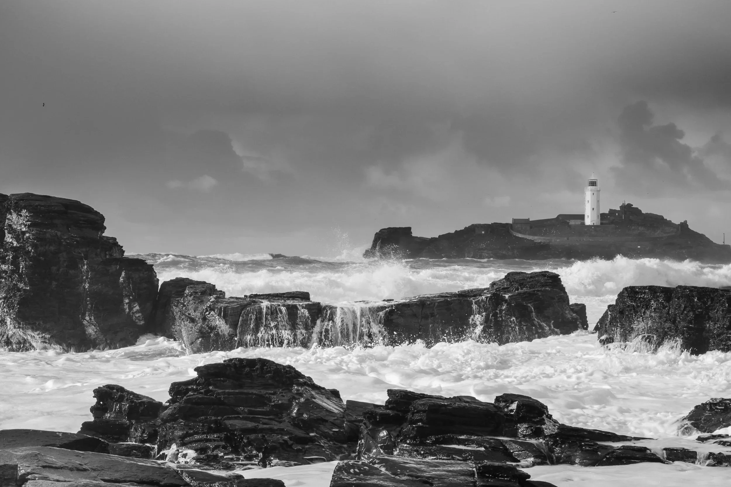
Storms on the British South Coast

Smoky Mountains forest using infrared
Output matters. Viewing on the screen vs print.
My workflow always ends with a high-quality A3 or A2 print. As a result, I edit with all my software having a pure white background. I often shrink the image I am working on to a thumbnail on a white background. By doing this, I can see how certain areas of the image are having an impact (or not) when potentially displayed in a frame with a white matt, which is my preferred final output.
A black-and-white image changes character depending on where it will be viewed.
Online: I keep contrast slightly brighter, knowing screens vary.
Print: Paper choice is critical. Matte papers can give a soft, artistic feel. I also relish not having any reflection from the paper. However, sometimes these matte papers can end up making the image look more washed out and less impactful. Adjustments may be needed to boost contrast and clarity when using these types of papers.
Gloss always gives deeper blacks, but it is a no-go zone for me. I just don’t like it.
However, semi-gloss baryta-style papers provide deep blacks and crisp detail. This is my preferred option if the matte paper version is looking too washed out. Sometimes these papers cannot be rivalled for their D-Max ability.
I use Fotospeed papers, which have all been custom profiled (Fotospeed make these profiles for free.) I use a 10-ink Canon 10 Pro s printer, which gives me dedicated blacks for true black and white printing. These printers are not as expensive as you may think…but the inks are another story!
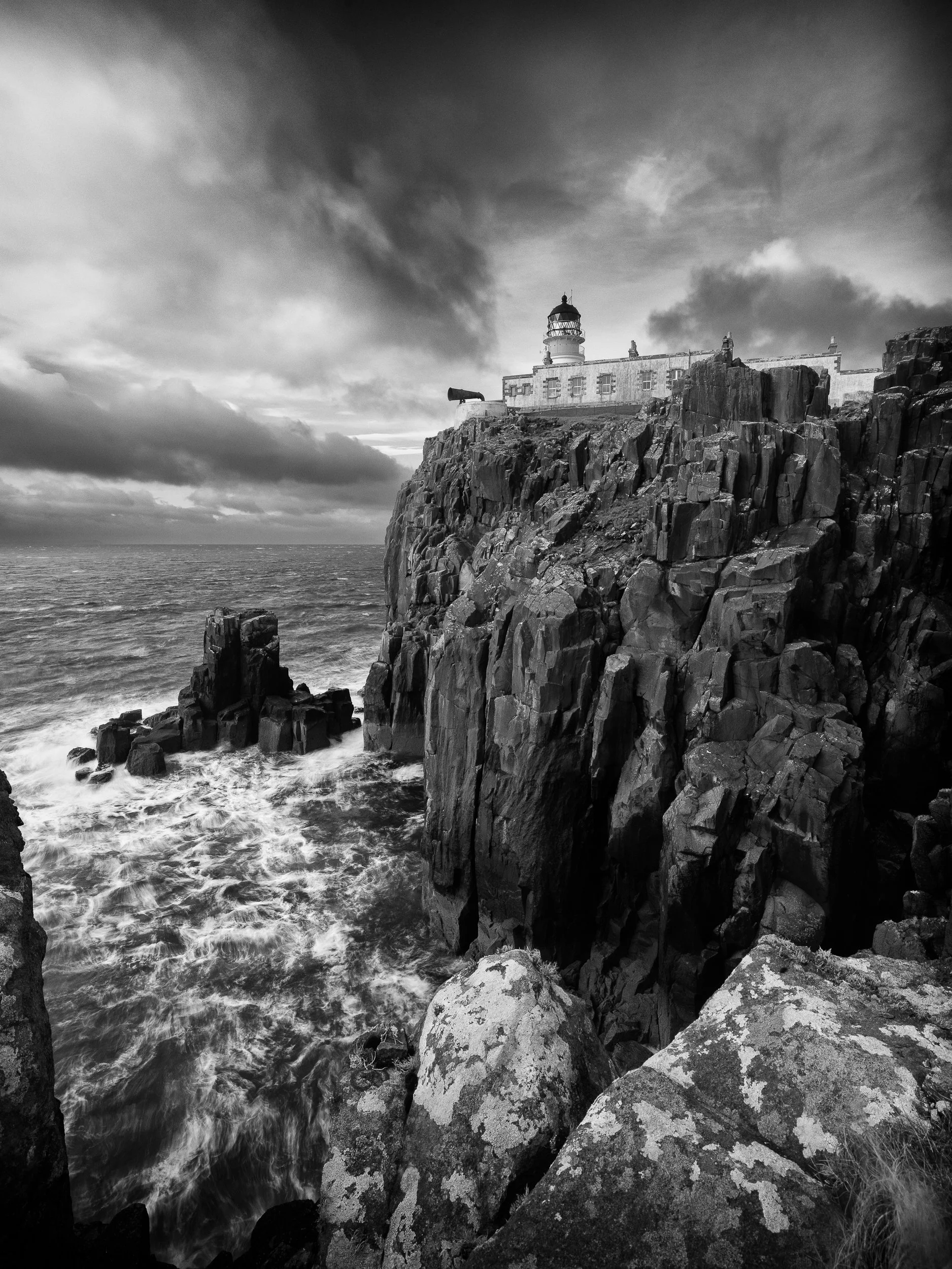
Isle of Skye, Scotland

Mockup using the Frameit app. This is what I have visualised before pressing the shutter.
Photographers Who Influence My Black & White Work
If you want to explore different approaches to monochrome, these photographers have shaped my own understanding of tone, mood and composition:
Ansel Adams - master of the Zone System and dramatic tonal control. An essential study for any B&W landscape photographer
Michael Kenna - minimalist, atmospheric landscapes
Daniel Rericha - stunning separation and simplification of the elements using tones.
Don McCullin - raw street and war photography. True grit, contrast and impact.
Sebastião Salgado - powerful, dramatic monochrome nature and documentary work
My black and white photography picture gallery
Each of them brings a unique voice to black and white, and studying their work can help sharpen your eye for tone, structure, and mood.
For me, creating black and white photography pictures as wall art is about the same principles shared by many fine art black and white photographers: Tonal range, depth, isolating the elements, and most importantly, conveying a personal interpretation of the scene.
I hope that helped to point the way over when, why and how to shoot black and white. Next blog is likely to be delving into the weird world of fungi.
If you have read this far, you may now be interested in my wall art black and white prints.
Please comment below, I would love to hear what you think about Black and White images